Landing pages are designed to get your attention and encourage you to take action. A landing page can be the designated page you’re taken to when clicking on a paid ad, often featuring beautiful landing pages that are customizable and designed by professionals.
Using tools to build landing pages that align with business needs is crucial. Landing pages are often used to drive website traffic, but they can also promote products, services, events, or other information.
To make this happen, they play a crucial part in advertising campaigns. About 61% of online marketers say generating traffic and leads is their biggest challenge.
They get your visitors to convert to leads or customers. That means they’re designed to persuade them to take action. Landing pages are unique because they’re the first point of contact between you and your potential customers.
Here is a guide to creating the best landing pages. First, let’s look at what a landing page is. Disclaimer: Note that some links and banners in this article are affiliate links, which provide us with a small commission if you complete purchases via those links. You can read the affiliate disclosure of our privacy policy in the footer.
What is a Landing Page?
A landing page is a website page designed to attract traffic and generate interest in your product or service. There are many different landing pages, but they all share the goal of getting people to click through to another site.
Click-through landing pages are a type of landing page designed to encourage users to navigate to another page for a specific action, such as making a purchase.
Some examples of landing pages include:
Product sales pages
Lead generation pages
Homepage popups
A landing page allows businesses to collect contact information from visitors. Landing pages are often used to generate leads and increase sales conversions. They are also helpful for lead nurturing and customer retention.
The goal of any landing page is to convert website visitors into customers.
Definition and Explanation
A landing page is a standalone web page designed to convert visitors into customers or subscribers. Unlike other pages on your website, a landing page is created with a single, focused objective in mind.
A minimal landing page emphasizes clarity and simplicity, effectively communicating the value proposition to users and guiding their decision-making process.
This makes it a crucial element in digital marketing campaigns, as it allows businesses to target specific customer segments with tailored information and persuade them to take a desired action.
Whether it’s signing up for a newsletter, downloading an eBook, or making a purchase, a landing page typically features a clear call-to-action (CTA) and a focused message.
This streamlined approach makes landing pages an effective tool for lead generation, sales, and brand awareness.
Key Difference Between a Homepage and a Landing Page
The primary difference between a homepage and a landing page lies in their purpose and design.
A homepage serves as the general introduction to a website, offering visitors an overview of the company, its products or services, and navigation links to other pages. It acts as a gateway, guiding visitors to various sections of the site. The entire page is designed to enhance user experience by keeping interactions, such as clicking on a call-to-action (CTA), within the same page, providing access to information and forms without navigating away.
In contrast, a landing page is a dedicated page designed to achieve a specific marketing goal, such as generating leads, promoting a product, or encouraging sign-ups.
Unlike homepages, landing pages are typically free from navigation links and other distractions, allowing visitors to focus solely on the desired action.
This focused approach makes landing pages highly effective in converting visitors into leads or customers.
Why Do you Need Landing Pages?
A landing page is a website page designed to attract visitors and get them to click through to another site. Landing pages are often used to promote websites, collect emails, sell products, or generate leads.
When someone clicks on a link from an email or social media post, they’re taken to a landing page. These pages are optimized to convert visitors into customers. Landing pages are an essential component of any website marketing strategy.
A Profile landing page is just what one site needs to maintain reader interest and facilitate growth, even in times without specific product promotions.
Using landing page builders to create impactful landing pages without requiring coding skills can significantly enhance your marketing efforts.
These builders offer intuitive drag-and-drop functionality, customizable templates, and tools for optimizing conversions, making the process of designing effective landing pages streamlined and user-friendly.
Landing pages allow you to test different versions of your site before launching them publicly. You can also use landing pages to collect information about your visitors’ interests and preferences.
They are often used to promote free offers, but they’re also great for generating leads, driving traffic, and increasing conversions.
Benefits of Landing Pages
Increased Conversions
A landing page is designed with one primary goal: to convert visitors into customers or subscribers.
By providing a clear and focused message, landing pages can effectively persuade visitors to take the desired action, resulting in higher conversion rates.
Whether you’re looking to generate leads, sell a product, or encourage sign-ups, a well-crafted landing page can significantly boost your conversion metrics.
Improved User Experience
Landing pages offer an improved user experience by delivering relevant and targeted information to visitors.
By removing navigation links and other distractions, landing pages allow visitors to concentrate on the desired action, making it easier for them to find what they are looking for and take the next step.
This streamlined experience not only enhances user satisfaction but also increases the likelihood of conversion.
Enhanced Brand Credibility
A well-designed landing page can enhance your brand’s credibility by providing a consistent brand professional platform to showcase your products or services.
High-quality visuals, clear messaging, and a strong call-to-action (CTA) can establish trust with visitors, making them more likely to convert.
By presenting your brand in a polished and professional manner, landing pages can help build a positive perception and foster long-term customer relationships.
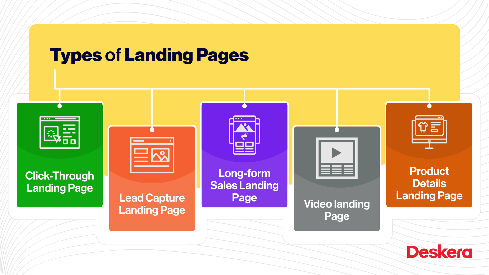
Types of Landing Pages
Landing Pages come in many different shapes and sizes. Other landing pages, like Shopify’s and Bouquet Bar’s, utilize simple yet persuasive designs to effectively communicate key messages to users. There are splash pages, squeeze pages, and sales pages. Splash pages are designed to get visitors hooked on what you’re offering.
Squeeze pages are usually short and sweet. Sales pages are longer and more detailed.
A dedicated landing page is crucial for optimizing paid search campaigns and improving ad visibility. Without a landing page relevant to visitors’ searches, advertisers risk penalties that affect traffic and conversion rates.
Additionally, dedicated landing pages are specifically designed to enhance marketing campaign effectiveness by providing a focused experience that drives better results.
You can use landing pages for any type of call to action, including registration, subscription, downloads, purchases, etc.
But there’s a difference between a good landing page and a bad one. Here are three ways to tell if your landing page is working.
Splash Landing Pages
Splash pages are great ways to capture a visitor’s attention and generate leads at key touchpoints on your site. You can create them on any website page, not just the homepage.
A splash page will often contain a headline, a description of your offer, and a button to call you or click through to your site. Some splash pages also include a form to ask for contact information.
Splash Pages are often the first or 2nd impression someone has with your company, so you may include an ask with a high reward.
An example could be asking for contact information at the end of a page. First-time visitors are more likely to provide their email addresses in exchange for a free eBook but less likely to sign up for a $200 training program if they haven’t had any previous experience with your company.
A splash page captures attention and leads users through the website. It usually does this with a call to action at the end of the main page itself, asking the user to sign up for something.
A splash page often includes a headline and a short description of what the site offers. It may also include a picture or short video somewhere.
These elements give the reader a sense of what the site will be like once they enter. Splash pages are designed to get readers interested in the product or service before reaching the rest of the site.
They may not be interested in your offer, but if they click on the button at the bottom that says, “I’m not interested,” they won’t get any further emails from you. You will still have an opportunity to convert them into leads later.
A squeeze page is an online form that collects contact information. Squeeze pages are not very effective at driving traffic because they usually require visitors to provide personal information before getting access to any real offer.
Lead Generation Landing Pages
A squeeze page is an online marketing tool that helps you generate leads. Squeeze pages are usually short sales copy designed to get visitors to click through to your landing page.
A squeeze page will contain a compelling headline, an irresistible offer, and a clear CTA button. Visitors should quickly understand the page and what they need to do next.
Sales Lading Pages
Sales Pages are designed to convert leads into customers. While splash and squeeze pages are targeted toward new prospects, sales pages often focus on converting warm leads who have already interacted with you.
Sales pages are called landing pages, lead capture forms, or conversion optimization pages. They’re the first page leads see after searching for information about your product or service.
Sales pages are high-stakes revenue generators. Until you see the conversion rate you want, find other ways to get traffic, like social media ads or Google Adwords. You can also use splash pages to collect emails before a new visitor lands on your site.
Squeeze pages are great for generating new leads with a strong benefit or offer. And sales pages encourage sales and a deep relationship with the customer.
Use these landing page examples to start your effective marketing campaign!
Lead Capture Pages
Lead capture pages are specifically designed to gather contact information from visitors, such as names and email addresses.
These pages typically offer something of value in exchange for the visitor’s information, like a free eBook, a discount code, or access to exclusive content.
The primary goal is to build a list of potential customers that can be nurtured through email marketing or other forms of communication.
Click-Through Landing Pages
Click-through landing pages are used as a middle step between an ad or a piece of content and the final conversion page.
They provide additional information about a product or service to persuade visitors to click through to the next stage, usually a purchase or sign-up page.
These pages often include compelling visuals and concise copy to maintain the visitor’s interest and encourage further action.
Thank You Landing Pages
Thank you landing pages are shown to visitors after they have completed a desired action, such as filling out a form or making a purchase.
Thank you landing pages confirm the action taken and often provide additional information or offers to keep the visitor engaged.
They can also include social sharing buttons to encourage visitors to share their experience with others.
Product Launch Landing Pages
Product launch landing pages are used to generate excitement and gather interest for a new product or service before its official release.
These pages often include teasers, countdown timers, and pre-order options to build anticipation and encourage early sign-ups or sales.
Event Registration Landing Pages
Event registration landing pages are designed to promote and secure registrations for events such as webinars, conferences, or workshops.
They provide detailed information about the event, including dates, locations, speakers, and agendas, along with a clear call-to-action to register.
Best Practices to Design Landing Pages
Here are some best practices you should implement in your landing pages
Focus your headline on the benefit
Choose an image that tells a story.
Write compelling copy.
Use a strong headline.
Include the lead form at the top of the page.
Add a clear and bold CTA.
Give away something valuable.
Ask for only what you need.
Optimize your landing pages for search engines
Don’t forget to add a thank you page.
A high converting landing page is uniquely designed to focus on a single conversion goal and features engaging designs that drive visitor actions, such as signing up or making a purchase.
We’ve broken down this landing page best practice tips below. You may not need all of them, but you should at least try to implement one or two.
1. Craft a headline focused on the benefit
Your headline is the first thing potential customers see when they arrive on your website. It must be clear and concise and communicate your product’s or service’s value.
If you’re selling something physical, like an item or a service, your headline might say “Buy my book” or “Get my shirt.”. If you’re selling a digital product, like software or a course, your headline might be “Try out our app” or “Learn how to code.”
2. Choose an image that tells a story
A picture speaks a thousand words. An effective landing page needs to have an image representing visitors seeing see when they land on single page of your site. Some photos are better than others, so it’s essential to split-test your options.
You can also try different images to see which gets the best response. Impactful landing pages can increase conversion rates by incorporating compelling visuals and tailored content.
About, 80% of users are likely to read content that is combined with images.
3. Write compelling copy
Copywriting isn’t just about writing headlines and images. Landing page copywriting is about guiding visitors through an experience that encourages them to act. A compelling copywriter understands what motivates customers and creates messages that speak directly to those motivations.
To create landing pages that improve user experience and conversion rates, it is essential to focus on engaging content and best practices for design and functionality.
Writing copy guides readers through an experience that encourages action is called persuasive copy. Copywriters develop experiences that encourage visitors to take specific steps.
These actions could be signing up for a newsletter, downloading a file, making a purchase, filling out a form, or sharing a link.
4. Include the lead form at the top of the page.
Lead forms must easily find your lead forms if your prospects want to convert immediately. Your landing pages should be designed to be above the fold. That means the form will be visible when users first land on the page.
You may also consider making the form scroll with the visitor as they move down the landing page.
5. Add a clear and bold CTA
The Call to Action (CTA) is one of the most important elements on your landing page. It’s one of many elements that encourages conversion. The CTA Button must stand out, so you should use a color contrast with other elements on the landing page.
Make sure you communicate what visitors want to click through to next. Use an action word that spells it out for visitors, like “Submit,” “Download,” or ‘Get it Now!”. The best converting call to actions are personalized ones as they can convert 202% better than the generic ones.
6. Give away something valuable.
Your landing page is like the first impression of your company. It should be compelling enough for visitors to sign up for your newsletter, download an eBook, or buy a product. But it should also be relevant enough to your business to convert them into customers.
If you sell shoes, your landing page might show pictures of cute kids wearing your sneakers. Or, if you’re selling health products, it could feature before and after photos of someone who lost weight using your supplement.
You would never put a horseshoe ad in a magazine because it doesn’t fit the topic. A horseshoe ad would go in a magazine about horses. If you were selling shoes, you’d probably write an article about hoof care. But if you were selling shoes, then you’d need to sell shoes. That’s why you’d create a landing page for your product.
7. Ask for only what you need.
When trying to get someone to buy something, you’ll often have to ask them for a lot of personal information. You might ask for their name, email address, phone number, mailing address, and social security number.
But there’s a big difference between asking for all those pieces of information and asking for just enough to create a low barrier of entry. If you ask for too much information immediately, you’ll scare potential customers away before they’ve had a chance to become interested.
On the other hand, if you ask for too little information, you won’t be able to follow up with them later. So, what should you ask for? That depends on the stage of the buyer’s journey you’re at, and how well acquainted, they are already with you.
8. Make your landing pages mobile responsive
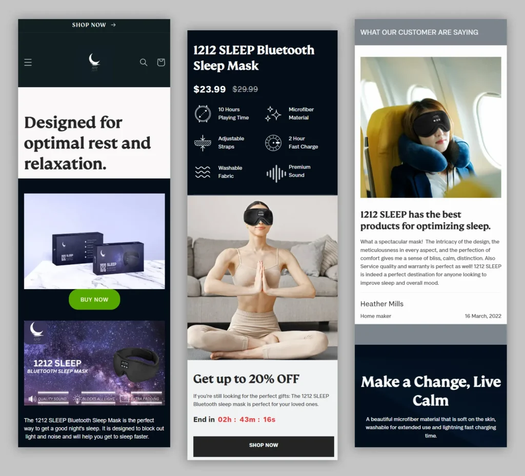
Your landing pages should be designed to fit any device. If you’re unsure if your site will work well on mobile devices, try testing it yourself.
Using Google Chrome’s Responsive Design View, you can easily test your site on different browsers and devices.
You’ll see what works best for each screen size. Once you’ve found the perfect layout, you can save it as a template for future use.
You can also use tools like HubSpot’s drag-n-drop landing page editor to easily create mobile-optimized landing pages. You can add custom CSS to give your landing pages a unique look.
9. Optimize your landing page for Search
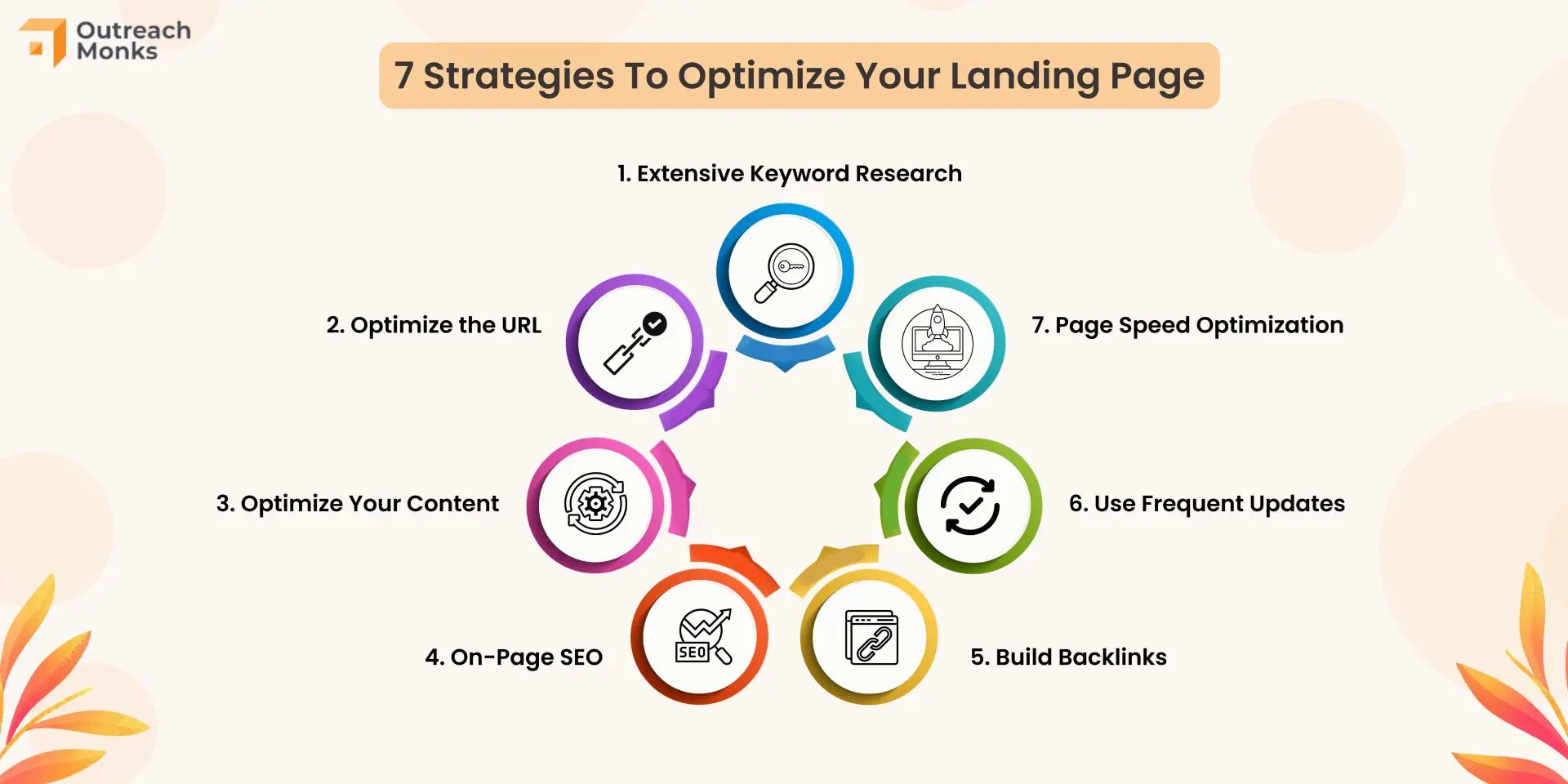
If you want people to find your landing page when they search online, you need to ensure it shows up high in search results.
A good landing page template should be simple, have direct CTAs, and integrate with other applications. This means optimizing your page title, meta description, URL, and content.
Doing this increases the likelihood that people will click through from search engines to your website.
10. Remember to add a thank you page
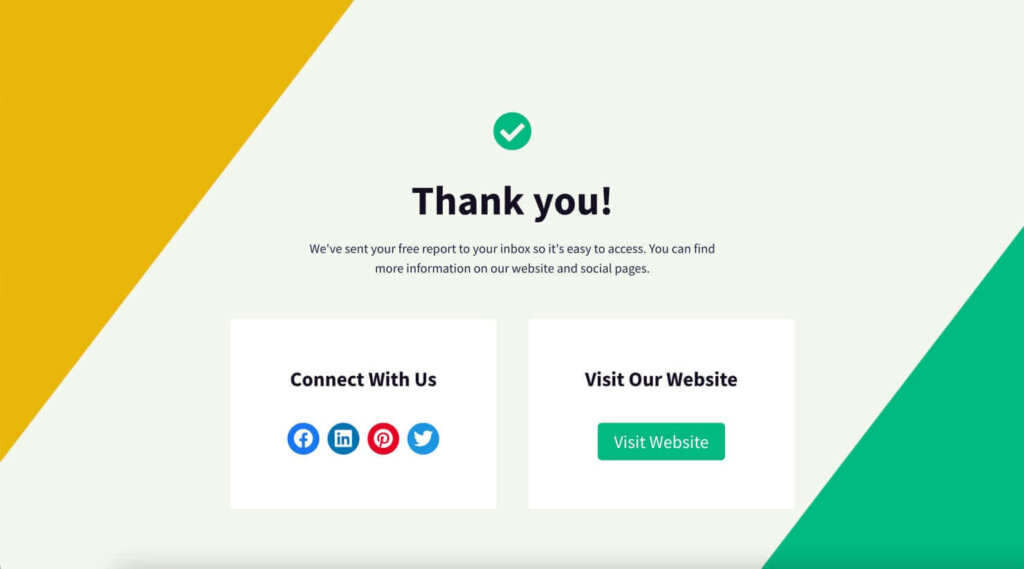
A thank-you page is where you send your leads when they complete your form. You could just show a simple “thank you” message on the same page, but there are many benefits to sending them to a separate page.
It offers the product/service you promised (usually delivered immediately).
It allows you to get your new lead interested in additional relevant content.
It helps to thank them for their time and interest, which goes a very long way in promoting them down the line.
For example, if your business offers a free eBook, you’ll want to include a thank you message for people who downloaded it.
Elements of a Landing Page
Your landing page is the first thing visitors will see when they arrive at your website. That means it needs to get them excited about your product or service. You need to highlight exactly why they should visit your site and what value they’ll receive.
Your landing page should answer all of those questions concisely.
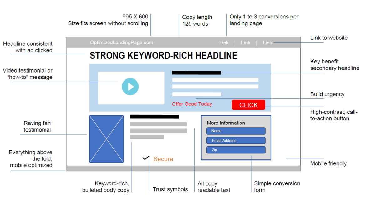
Image Source: Amperage Marketing Fundraising
Include a Unique Selling Proposition (USP)
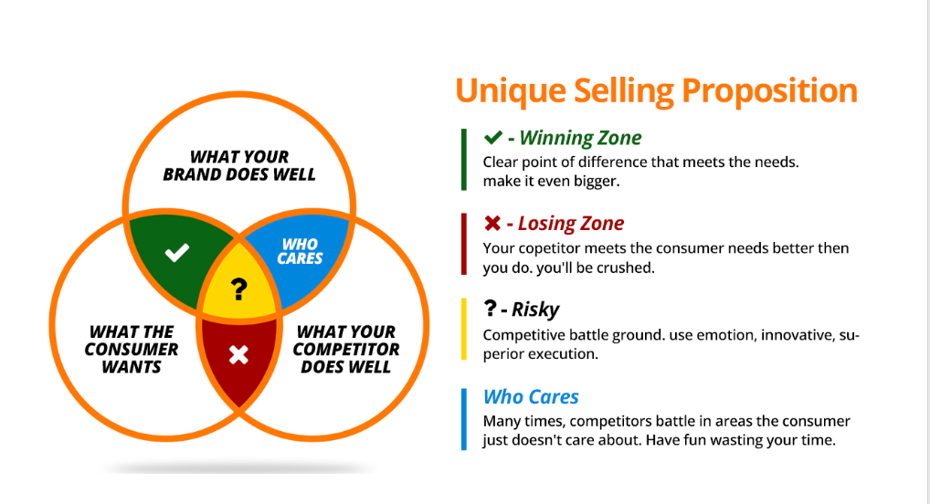
Your Unique Selling Proposition (USP), also called your value proposition, differentiates you from other companies in your industry. It’s the reason why people buy from you instead of someone else.
A strong USP will help you stand out from the crowd and get noticed. It’s also important because it helps you attract qualified leads. You’re missing out on sales opportunities if you don’t have a compelling USP.
A clear call to action
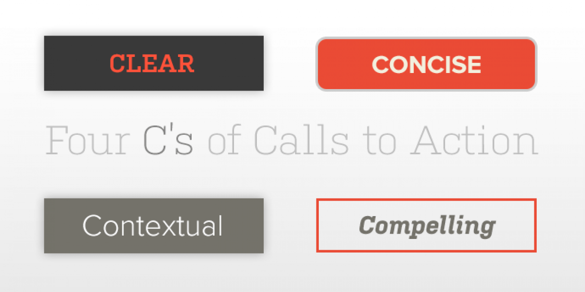
You should always add a clear call to action on your landing page. You need to give visitors something to click on and get them to engage with your brand. Your headline should also be compelling enough to grab attention.
A strong and clear headline
A great headline will help you stand out from other businesses and can even lead to higher conversions. Make sure your copy is engaging and relevant to the visitor.
Don’t try to sell them anything just yet. Instead, let them first explore your site and learn about your product or service. Once they’re interested, you can introduce yourself and ask them to buy.
Social Proof is a great way to increase trust and influence others. To create a strong trust, consider using testimonials, endorsements, awards, reviews, and other social signals.
These are all ways to show that others like your product or service. Social Proof is especially effective when combined with other persuasion techniques, such as storytelling.
How to Design Landing Page Design
Designing a landing page requires both your right and left brains. Designing a landing page also includes functional, direction-oriented, and effective elements.
You will need to tap into both your creative and analytical sides.
Below, we will discuss each element and how to incorporate them into your landing pages.
Landing Pages’ Structure
![The Anatomy of a Landing Page [Includes Illustrations]](https://www.globaltechstack.com/wp-content/uploads/2025/01/18_AnatomyofLandingPage.jpg)
There are several ways to create a great landing page. Some of them are:
Make sure your headline is catchy.
Include a hero image that is relevant to what you’re selling.
Use the right colors and fonts.
Make sure everything is easy to read.
Lead form. The form sits above the fold and captures visitors’ information.
Call to action (CTA) is action-oriented, compelling, and informative.
Copy and description inform and entice your visitor to complete your lead form. Source.
Can you add even more? Of course!
Think social share buttons that visitors will use to spread the word. These are simple elements that help you create an effective call to action.
The goal is to collect all the necessary information to move your prospect through the sales funnel. If you’re not collecting enough info, you’re missing out on opportunities to close deals.
To measure to what’s happening on your page connect google analytics to your landing pages.
And lastly, make sure your landing page loads quickly!
Landing Page layout and templates
This may seem strange, but most visitors won’t read every word of an article. Instead, they’ll scan it, looking for the most important points first. About, 46% of marketing professionals believe that form layout influences whether visitors choose your landing page.
So, keep the most important info above the fold, so readers don’t have to scroll down to see it.
Also, perform a Blink Test to ensure your text isn’t too long. If you wait longer than 5 seconds for someone to blink, you might lose them.
White space is a great tool to help you create a clean design. White space helps break up your text and gives your visitors room to breathe.
Use bullet points and short paragraphs to help your readers understand what you’re saying.
Make sure to place your most important information at the top of the page. Following the F-Pattern will direct your audience to the most important parts of your web page.
Landing Page Colours
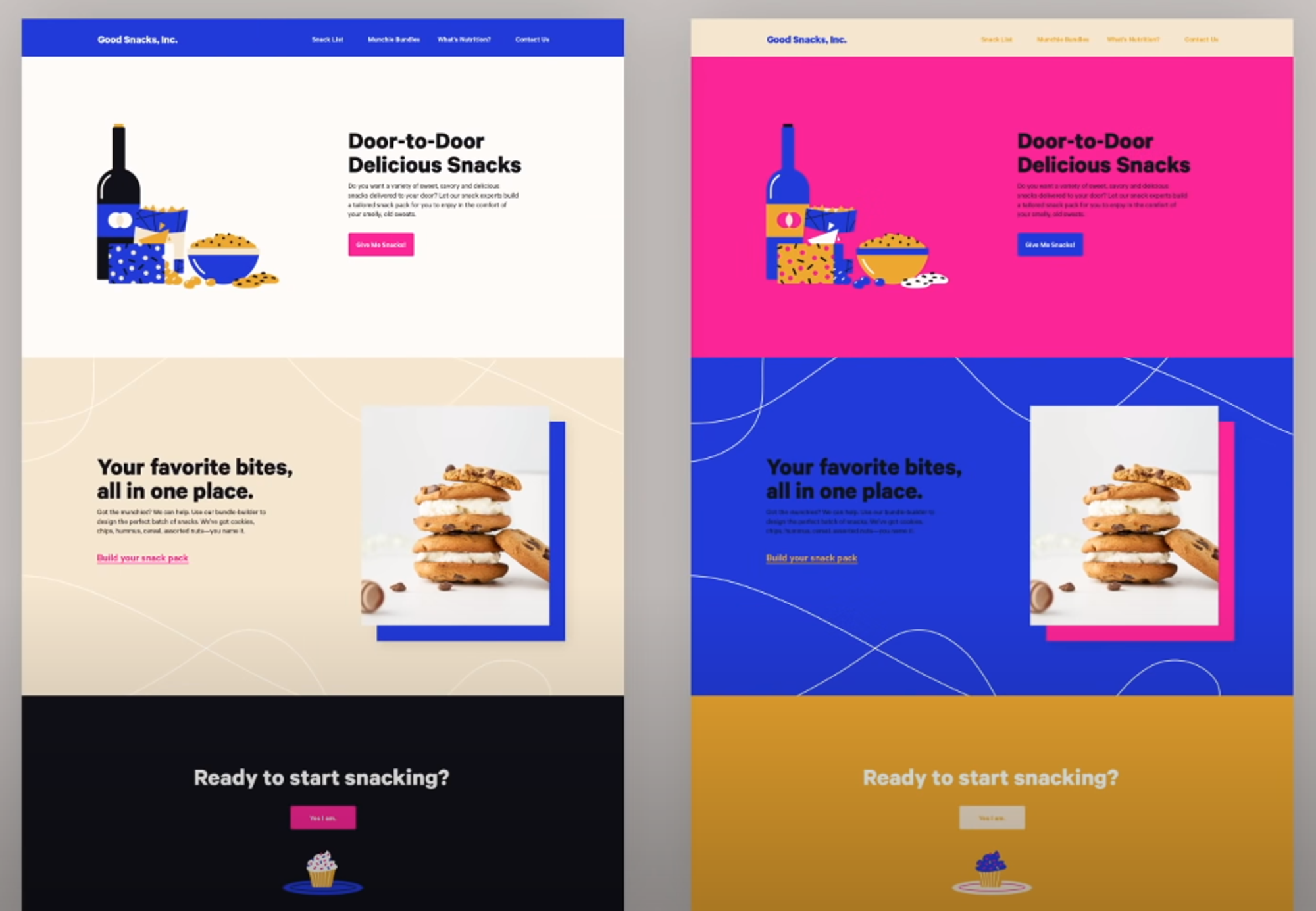
Your landing page needs to match your site’s visual identity. If your site is mainly green, you should stick green on your landing page. But if you have many whitespaces on your site, you might want to go bolder with your colors on your landing page.
Landing page images
When choosing an image for your landing page, there are several factors to consider. First, what will the image convey about your brand?
Will it be professional and polished, or casual and fun? Second, what is the best size for the image? Is it too small to read or too big to fit in the frame?
Third, if you’re using an animated GIF, does it look like something you’d want to watch?
Finally, once you’ve got a great image, how can you ensure it looks it’s absolute best?
There are many ways to achieve this, including cropping it to just the right dimensions, adding a dark background here, and even tweaking the colors.
Your persona is a representation of yourself. It’s an amalgamation of all the information about you that you’ve shared online. You’ve probably heard stories about companies that made a huge mistake by not creating a persona before starting a project.
For example, if you were a young female entrepreneur, you might create a persona like this: “I’m a fun-loving, friendly, and outgoing woman who loves working out.”
Your persona should reflect your brand, company, product, service, etc. It should also be consistent across all brand assets and all channels.
If you’re trying to get your website users to complete a form, consider using images that direct them to the form. These images should be visually appealing but not distracting. People tend to notice what’s important first.
If you want your website filled out, consider using images that direct users’ attention to the forms. This could help increase conversions and reduce bounce rates.
When designing a landing page, you need to think about what type of audience you will be reaching out to. What are the main benefits of your product?
How can you show them those benefits through imagery? You must also consider what kind of visual language best fits your brand.
For example, if you’re trying to create a professional website, you may want to stick to simple fonts and colors. If you’re selling products meant for kids, you might want to go with bright colors and cartoonish graphics.
Call to action design.
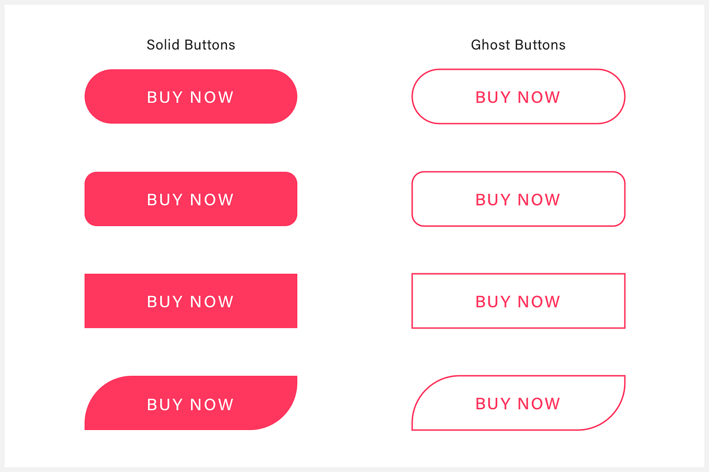
Your call to action should stand out from the rest of your site.
Your CTA should be large enough to be easily visible on any screen yet still fit within the boundaries of your website.
Make sure that your CTA stands out against other elements on your page.
Use a vivid and contrasting color, and ensure that it contains the benefits of your product or service.
You may also consider adding a hover effect to your CTA if you think it would help increase conversions.
Don’t get caught up in the details.
Try to keep your message simple.
Don’t write like an academic paper.
Keep your sentences short and sweet.
Use action verbs instead of passive voice.
Write in the third person.
Focus on the benefits of your product or service.
Avoid long paragraphs.
And don’t forget to proofread!
Mobile landing pages
Mobile users account for around 50% of all web traffic. Responsive design allows you to create an optimal user interface and experience across multiple platforms.
Using content management software that includes free landing page builder tools can streamline the process of creating mobile-optimized landing pages.
These tools often feature drag-and-drop functionality and access to free themes and templates, facilitating faster setup and optimization for better search rankings.
Your site will load quickly and display correctly regardless of what type of device your visitor is using. You’ll also save time because you won’t need to create different versions of the same page for each platform.
Check out these landing page examples for design inspiration below.
Your job isn’t just to write words. You’re also responsible for the overall tone and feel of your site. That means you must pay attention to what other websites are doing and emulate those elements that resonate well with your audience.
If you’re not sure about something, try asking an expert. But here are some tips for you to use.
Make sure to cover the main points.
You should always start with your persona’s pain point. You must understand why they are using your product before you can effectively market to them. Your product may solve their problem, but you won’t get any sales if they aren’t aware of it.
If you are trying to sell software, you need to think about the benefits of your product to the user and how it solves a problem.
For example, if you are selling an accounting system, you might say that it helps small businesses keep track of all their finances. That’s great, but how does it benefit someone? Maybe they just want to save money.
So you need to answer that question and develop a benefit that resonates with your audience.
It’s important to talk about the pain point your product will solve. Don’t just say “I’m solving the problem” because that may not resonate with your audience.
Talk about the problems your persona is currently experiencing and why you think your product will help them. If you can empathize with your persona, they’ll be more likely to buy into your idea.
It’s not just about solving their pain point but also making sure they understand why you’re doing it. Your pitch should explain why you’re working together and why they should care.
Show them how it solves their problems if you pitch a product. If you’ve built something cool, tell them about it. Make sure you’re communicating effectively.
You need to think about the benefits your product provides to your customers. You should also explain why those benefits matter to them. For example, if you’re selling software, talk about how it’ll save time and money.
If you’re offering consulting services, tell them how it’ll help them grow their business. If it’s a physical product, describe its features. Make sure your potential customer knows exactly what they’ll get when they buy from you.
You must understand the users’ needs and pain points before creating value. You must think about how they feel and what problems they face. When you create a benefit statement, it helps you focus on the right things.
It also allows you to show empathy and understand what motivates someone to buy from you.
Social Proof is a concept that shows people what other people think about a certain topic or idea. Studies show that social proof is an effective tool for convincing people to take a desired course of action.
Social proof comes from logos of brands you’ve previously worked with, testimonials from previous clients, reviews from previous customers, or confirmation that others are using your solution.
In essence, people need to see that others are already using and benefitting from your solution before they consider buying it themselves. By including social proof in your landing pages, you’re validating the value of your offer without even saying a word.
Respond to objections
A key component of persuasive copywriting is dismantling objections before they arise. If you’re unsure what objections will arise, ask yourself questions like “What could my audience say that I haven’t already thought of?”
or
“What information should I provide to prove that I’m right?” You may also need to enlist a trusted colleague or mentor to help you identify potential objections.
This exercise will help you cover every single objection you could think of. You should also consider getting feedback from friends and family who aren’t biased toward your product.
If someone tells you something about your landing page you didn’t expect, check it out and see if it still holds. Don’t just blindly accept what others tell you. Use all available sources of information to create the best landing page possible.
Our friends at Toptal have put together the ultimate guide to landing page design. Have a look the article to get more tips.
Build trust with your audience
This is a great example of why you should always write as you talk. They will think you are selling them something if you sound like you’re trying to sell them something. Instead, focus on what they need and give them solutions.
Besides using social proof (i.e., asking people for reviews), there are other ways to build trust:
Write how you speak and address your prospects like a live customer.
Cite statistics that support your message.
Use case studies that highlight customers similar to your target.
Be relatable. Show your audience that you’re human by admitting failures, opening up about doubts you’ve had, and being honest. The caveat is you should only share what is relevant to their struggle; don’t just divulge anything.
Use click triggers

Click triggers aren’t just for fun. They’re an essential part of any conversion optimization strategy.
Click triggers are designed to eliminate the last bit of doubt before someone clicks. They’re essentially probability enhancers. Think of them like lick probability enhancers.
The copy positioned next to your call to action nudges your prospect over the edge and helps mitigate the risk of converting.
Here are some examples of effective click triggers:
A money-back guarantee if you have that in your policy.
Quotes from happy customers.
What to expect when you sign up.
It doesn’t matter what type of product you sell, whether it’s an eBook, a service, an online store or a physical item. We’ll show you how to get more customers using the same strategies we’ve used to get millions of dollars of sales every year.
You’ll see how easy it is to start making money online, even if you have zero experience.
A/B Testing your Landing Pages
Split testing is not something that every company needs to do. You need to understand why you should split test before you start.
You’re wrong if you’re doing split testing because you think it will help you get more conversions. Only 17% of marketers use landing page A/B tests to improve conversion rates.
If you’re doing it to measure an ad campaign’s effectiveness or determine which version of a landing page converts better, you should split test.
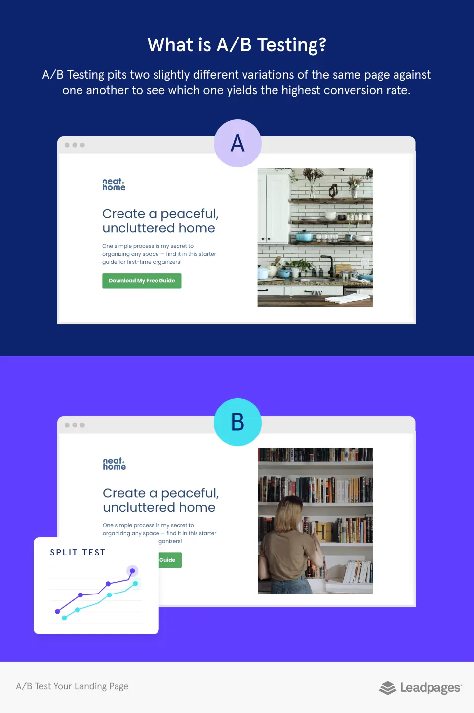
What is A/B testing?
An A/B test is a simple way to compare different versions of website pages to see which one works best. You can modify the original page directly or create a new version using a tool like Google Optimize.
Then you can launch both versions at once and let visitors choose which one they prefer. If one variant does better, you can keep it as the winner. You can also run tests multiple times to see any trends.
How to Do an A/B Test for your landing pages
The most effective strategy when splitting tests is to run them separately. If you try to do both simultaneously, you will not be able to tell if one is working better than another.
So instead of trying to compare two or more elements together, focus on just one. Once you’ve found the winning combination, you can move on to the next element. Repeat this process until you get a conversion rate that you like.
What you should Test on your Landing Pages
Your landing page should be designed to test everything. You should try out different headlines, colors, images, call to action, copy, lead forms, and even the length of time before someone clicks away. If you’re testing something that doesn’t seem to matter, chances are it does.
So start small and work your way up. Start with the smallest changes, like changing a headline or CTA text color. Then move on to bigger changes, like adding an image or changing the background. Once you’ve tried all of those, you’ll be ready to tackle the rest.
What Landing Page Metrics Should you Track?
Metrics are important because they help you understand how your visitors interact with your website. You can see if there are any problems with your site design, navigation, or copywriting.
Metrics also show you the best times to send emails, post updates, and promote your page. If you’re not tracking your metrics, you won’t know if your efforts are working.
Page visits
You should track your visitors’ activities on your site. If you see that your visitors aren’t converting, you need to adjust your paid strategy or redefine your keywords.
You can also inform them about your offer via emails, social media, or your website or landing page visitor.
Traffic sources
It’s crucial to know where your landing page traffic comes from because it will help you make decisions about distributing your marketing resources for promoting your landing page content.
Submission Rate
Sum of all submissions for the landing page. There are many ways to optimize your own landing page inspiration other pages. Make sure to A/B Test different elements on your page. You can also change your messaging and copy to see if there is an improvement in conversions.
Contacts
Sum of all submissions for the landing page. There are many ways to optimize your landing pages.
Make sure to A/B Test different elements on your page. You can also change your messaging and copy to see if there is an improvement in conversions.
Heat MappingC
Heat map showing the distribution of form submissions over time, with color indicating form submissions as a percentage of total clicks each day.
Heat mapping is a way of identifying user behavior by showing them how their actions affect how others interact with their websites.
Heat mapping lets us see which parts of our site are more popular than others and where they’re going after clicking on something specific.
We can also use this data to optimize our sites’ layout and design so that we reach as many users as possible without overloading them with too much information.
Contacts
The bounce rate is calculated by dividing form abandonment (not shown in heat mapping) by total clicks on the day it occurred. The percentage of people who leave without interacting with your site after visiting it.
This should be less than 50%, or else it means people don’t think your content is interesting enough to stick around long enough to decide what they want next in their lifecycle.
If your landing page is promoted in a blog post, ensure it’s related to the post. Don’t just add a landing page link with no link or relation to your content.
Form Abandonment
The percentage of visitors who abandon a form before completing it could be because they didn’t see a call-to-action that encouraged them to fill out the form (like a download button), or they just found another website more appealing than yours.
If there is form abandonment, it could be that you are not reaching your target audience. Also, it could mean you don’t have strong enough calls to action.
Think about your ultimate goal for your landing page. If you are growing your email list, make sure the call to action shows that you want to build a relationship with your landing page visitor.
How to Make Your Landing Pages More Effective
There are many ways to tweak your landing pages to increase conversions. Here are a few suggestions to help you level them up.
Optimize your landing page
Optimizing your landing page doesn’t necessarily mean making changes to the whole page’s design itself. You might change the wording of your call-to-action buttons, add additional images, or even edit out certain elements altogether.
There are many different ways to optimize your landing page. We’ve outlined a few below.
Using content management software and specific landing page builder tools allows users to create free landing pages effortlessly.
These tools often feature drag-and-drop functionality, customizable templates, and integration with other applications to streamline the landing page creation process for both quick deployment and effective marketing strategies.
It doesn’t matter if you’re offering something for free or selling a product — at the end of the day, you still need to sell.
But, if you’re looking to get the word out about your brand, you’ll need to come up with an offer that will make someone say “yes” before they even read your pitch.
That means ensuring you have a solid call-to-action (CTA), clear value proposition, and compelling copy.
Is your offer solving a problem for your customers? Do you understand what problems they’re facing? Are you offering something that will help them get out of those problems? If you can answer yes to all three questions, then you’ve got a great opportunity!
Improve your page load times
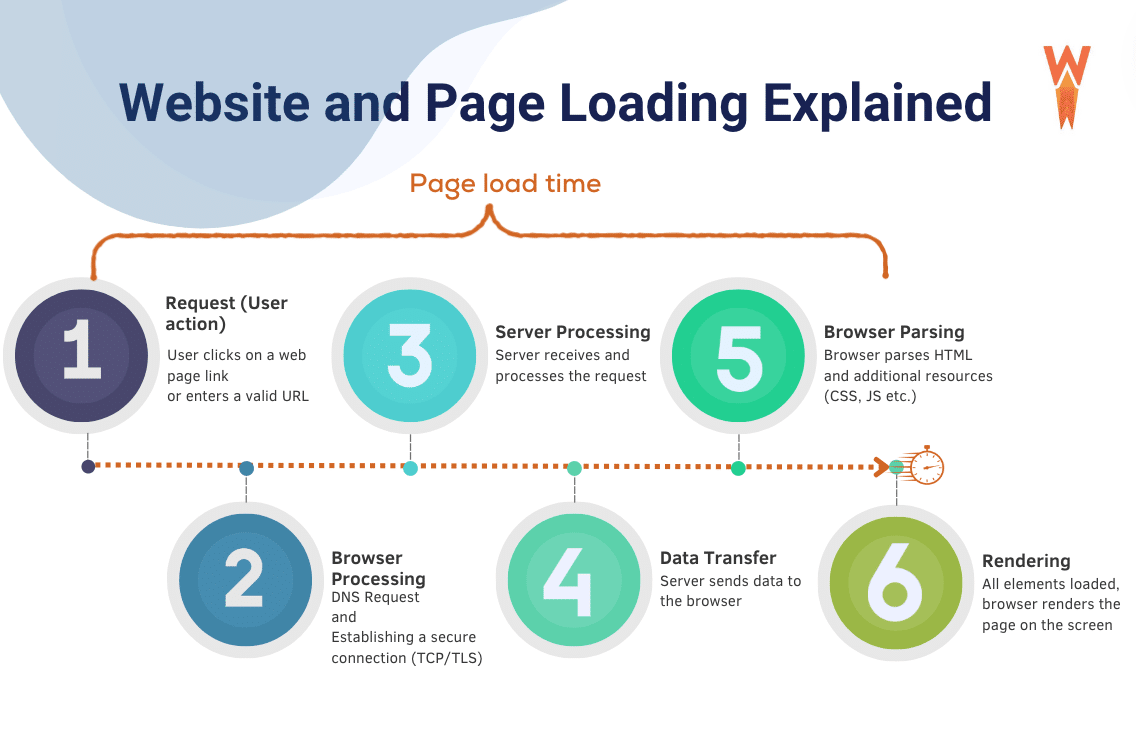
It doesn’t matter if you’re offering something for free or selling a product — at the end of the day, you still need to sell.
But, if you’re looking to get the word out about your brand, you’ll need to come up with an offer that will make someone say “yes” before they even read your pitch.
That means ensuring you have a solid call-to-action (CTA), clear value proposition, and compelling copy.
Is your offer solving a problem for your customers? Do you understand what problems they’re facing? Are you offering something that will help them get out of those problems? If you can answer yes to all three questions, then you’ve got a great opportunity!
Keep the buyer’s journey in mind at all times
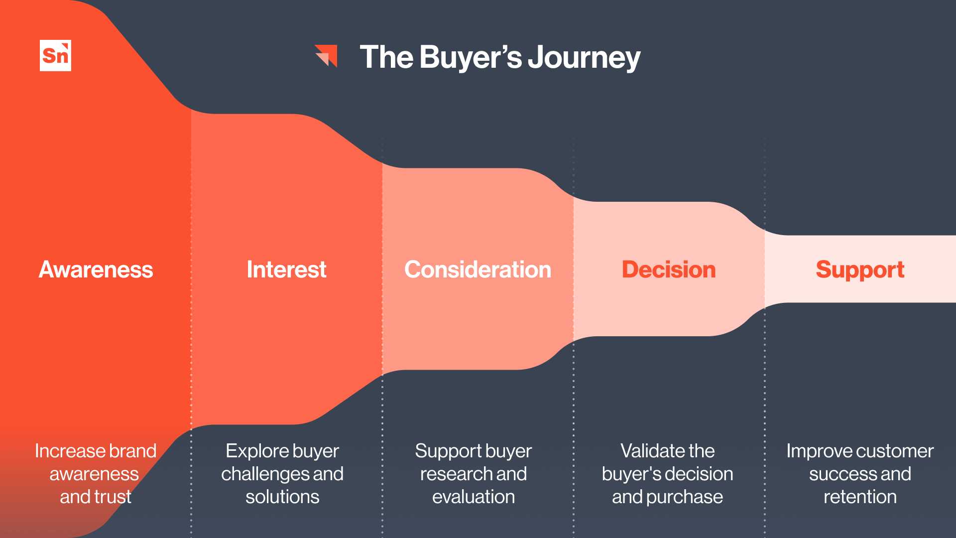
You should clearly know what stage of the customer’s buying cycle they are at. If they know the issue, you must provide them with information about your product or service.
If they are considering whether or not to buy your product, you need to convince them why it will solve their problems.
And finally, when they are ready to buy, you need to give them all the reasons why they should buy from you instead of someone else. You could also try to get them to complete an action like signing up for your newsletter or downloading your app.
Create a seamless user experience
A landing page is an important piece of any marketing strategy. It is where visitors will first encounter your brand. If you are not using landing pages effectively, you could lose potential customers. Landing pages allow you to test different versions of your website.
For example, you might try out different headlines, images, or calls to action (CTAs) to see what works best for your audience.
Landing pages also let you measure results. How many people clicked through? How long did they stay on your site? What were their interests?
These answers help you create future campaigns that target similar audiences. Landing pages allow you to experiment before spending money on longer forms of advertising.
Ensure your path to a high converting landing page is clear
Your landing page should be easy to navigate. When someone lands on your page, they need to know exactly what they’re supposed to do. You want them to convert, so you’ll need to provide clear directions.
Use images, text, or both to direct your visitors toward your form. Let your CTA stand out against other elements on the page. Using a contrasting color, like red instead of blue, will help your call-to-action pop.
Use arrows to direct visitors back to the form. Use links to bring them back to the form if they click away. Make sure your CTA is large enough to stand out.
Create scarcity in your offer
When people hear an offer is about to expire, they tend to act more quickly. Fear of missing out (FOMO) is an emotion that drives people to buy products.
When someone wants something badly enough, they’ll do anything to get it. This includes buying it at any price point, even if it doesn’t make sense. People will pay more for something they think is scarce.
Scarcity is a great tactic to get attention. You can use it to create urgency around an offer. To ensure you’re using it correctly, ask yourself if what you’re doing is scarce? Is there anything else out there?
If not, then you’re probably offering something that isn’t scarce. When you use scarcity, you should also consider timing. Scarcity works best when you’re offering a deal before someone else does.
For example, you could say “buy now” vs. “only five left.” Or you could say “limited time offer” vs. “this item will never be available again.”
Use video to showcase your offer
There are many benefits to using videos for marketing campaigns. Videos increase conversions because they allow viewers to better understand you and your brand.
https://www.youtube.com/watch?v=ggJ3ZYTkS40
A personal connection increases trust and decreases the likelihood that someone will leave before completing a purchase.
It is also important to ensure that there is a message match between your social media posts and the landing page to enhance user experience and conversion rates.
Also, when you use video to market products, you can show more information about the product and its features. For example, if you sell gardening tools, you could show how to use a tool to cut down a tree.
You can also show how to use a product to do something specific, like making a flower pot.
Video is an excellent tool to increase conversions to your website. You can also see a significant decrease in support requests and customer service issues. Video is processed 60,000 times quicker than text. If you want to engage your audience, you should consider adding a video section to your site.
How to ensure your audience is a successful post-conversion
You’re ready for the decision stage. You’ve done your homework and know exactly what your prospect needs.
Now it’s time to provide value, and you’ll do that through content or resources. If you’re unsure what to offer, consider creating an eBook or whitepaper to show potential customers how your product works.
Guide your contact along the buyer’s journey
If your lead is ready to buy, you should provide them with content or resources to move them through the sales funnel. Content marketing effectively increases awareness of your brand, products, services, and company culture.
If you’re unsure what kind of content will be best suited for your lead, try asking yourself these questions before creating any content:
What problem does my audience face?
What is the benefit I’m offering them?
How can I solve this problem for them?
Once you’ve answered those questions, you’ll be well on your way to crafting high-quality content that will resonate with your target market.
Build a meaningful relationship
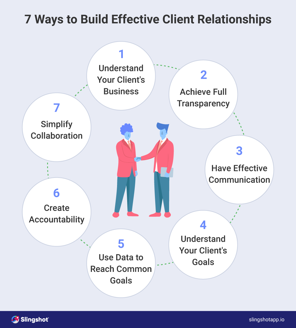
You may not have noticed it yet, but you’ve already built a relationship with your users. You’ve done so by collecting their contact information when they signed up to receive updates from you.
Now that they’ve permitted you to send them messages, you need to start using that information to help them out.
You’ll need to list how they might be interested in your product or service. That includes general interest topics like “How to use our app” to more specific ones like “What features did you love about our app?” Once you’ve identified those interests, you can start sending targeted emails to each user.
Purpose of a Landing Page
A landing page is a crucial element in any marketing campaign, serving as the first point of contact between a potential customer and a product or service. The primary purpose of a landing page is to convert visitors into leads or customers by providing a clear and concise message, showcasing the benefits of the product or service, and encouraging visitors to take a specific action.
A well-designed landing page can help businesses achieve their marketing goals by:
Increasing conversions and sales: By focusing on a single, clear call-to-action, landing pages can significantly boost conversion rates.
Building brand awareness and credibility: A professional and polished landing page can enhance your brand’s image and establish trust with visitors.
Gathering leads and email addresses: Landing pages are often used to collect contact information, which can be used for future marketing efforts.
Providing a seamless user experience: A well-structured landing page ensures that visitors can easily find the information they need and take the desired action.
Improving search engine optimization (SEO): Optimized landing pages can drive more organic traffic from search engines.
By understanding the purpose of a landing page, businesses can create effective and targeted marketing campaigns that drive results.
Sales Landing Pages
Sales landing pages are designed to persuade visitors to make a purchase or take a specific action. These pages typically feature a clear and concise headline, a compelling value proposition, and a prominent call-to-action (CTA).
The goal of a sales landing page is to convert visitors into customers by highlighting the benefits and features of the product or service.
Effective sales landing pages often include:
A clear and concise headline: Grab the visitor’s attention immediately with a headline that clearly states the main benefit of your product or service.
A compelling value proposition: Highlight what makes your product or service unique and why it’s the best choice for the visitor.
A prominent CTA: Encourage visitors to take action with a bold and clear call-to-action button.
Social proof and trust indicators: Build credibility by including testimonials, reviews, and trust badges.
A mobile-friendly design: Ensure that your landing page provides a seamless user experience on all devices.
By creating a well-designed sales landing page, businesses can increase conversions and drive sales.
Short and Sweet Writing
Short and sweet writing is essential for landing pages, as it helps to grab attention and convey the message quickly. The goal of short and sweet writing is to provide a clear and concise message that resonates with visitors and encourages them to take action.
Effective short and sweet writing includes:
Using simple and concise language: Avoid complex words and jargon that might confuse visitors.
Avoiding jargon and technical terms: Keep the language accessible to a broad audience.
Focusing on the benefits and features: Highlight what the visitor will gain from your product or service.
Using active voice and present tense: Make your writing more engaging and direct.
Keeping paragraphs short and concise: Break up text into digestible chunks to maintain the reader’s interest.
By using short and sweet writing, businesses can create landing pages that are easy to read and understand, and that drive results.
Eyeflow Design
Eyeflow design refers to the visual flow of a landing page, and how it guides the visitor’s attention. A well-designed eyeflow can help to increase conversions and drive sales by drawing attention to the most important elements of the page.
Effective eyeflow design includes:
Using a clear and concise headline: Start with a headline that immediately grabs attention.
Creating a visual hierarchy: Use headings, subheadings, and bullet points to guide the visitor’s eye through the content.
Using images and graphics: Break up text and add visual interest with relevant images and graphics.
Using white space effectively: Create a clean and uncluttered design by incorporating plenty of white space.
Using color and contrast: Draw attention to important elements, such as the CTA, by using contrasting colors.
By creating a well-designed eyeflow, businesses can create landing pages that are visually appealing and effective.
Testimonials and Reviews
Testimonials and reviews are essential for building trust and credibility on a landing page. They provide social proof that helps to establish the credibility of the product or service, and can increase conversions and drive sales.
Effective testimonials and reviews include:
Using real customer testimonials and reviews: Authentic feedback from real customers is more convincing.
Highlighting the benefits and features: Focus on specific benefits and features that customers have found valuable.
Using images and graphics: Add visual interest and make testimonials more engaging with images of customers or product usage.
Creating a sense of urgency and scarcity: Use testimonials to highlight limited-time offers or exclusive benefits.
Using trust indicators: Include badges, certifications, and other trust indicators to reinforce credibility.
By including testimonials and reviews on a landing page, businesses can build trust and credibility with visitors, and increase conversions and drive sales.
Grow your Brand with Landing Pages
There are many different types of landing pages, each with its unique purpose and design. Examples include Lead Generation, Sales Funnel, Content Marketing, and Customer Support. Each type of landing page requires its specific strategy and implementation.
Landing Pages are an important tool for any online business. They are designed to convert visitors into customers. They are often referred to as conversion funnels because they funnel traffic to other parts of your website.
Having a dedicated landing page for marketing campaigns enhances ad visibility and improves conversion rates by providing a focused experience tailored to specific campaign objectives.
If you’ve ever spent time creating a landing page, you know how challenging it can be I hope these tips we shared will make your job a little easier.
Check out our post on the best landing page builders to get started with your best landing page builder for pages.
Frequently asked Questions
What should a landing page include?
A landing page should contain:
Information about the product or service offered.
A call to action.
Some form of opt-in for the visitor to sign up for updates.
The goal of a landing page is to convert visitors into leads.
How do you write a good landing page?
There’s no single formula for writing a great landing page. But here are a few tips to keep in mind:
Give your visitors something to take away
Provide value to your visitors
Make it easy for them to find what they want
Use clear language
Keep it short and sweet
Include a link back to your homepage
Test everything!
How do I find landing pages?
There are several ways to find landing page templates. The first way is to search for a “landing page” on Google. You can also create your landing page using landing page builders like Landingi, leadpages, or Unbounce.
What are the different types of landing pages?
There are three main types of landing pages: conversion, lead generation, and sales. Conversion landing pages are used for conversions such as signups, downloads, etc. Lead generation landing pages are used for generating leads. Sales landing pages are used for selling products or services.
How much should I pay for a landing page?
How much you pay for a landing page depends on a lot of factors. One of the biggest is whether or not you will use this landing page to generate leads.
If you plan to use it to drive sales, you will probably need to invest a little bit more money than if you were simply trying to get feedback. However, if you’re building a lead gen page to gather names and collect email addresses only, you won’t have to spend nearly as much.
How do I make my landing pages stand out from the crowd?
Landing pages are usually used for lead generation, and they should be designed to attract visitors who want to learn more about your product or service.
The best way to create a great landing page is to use a template that has been proven successful, such as one from Leadpages.com.
What is the main purpose of a landing page?
A landing page is used to convert visitors into leads and sales. The goal of a landing page is to capture the visitor’s attention and encourage them to click through to your website.
Landing pages are usually optimized for search engines and should be designed to provide information about your business, product, service, or organization.
What makes a good landing page?
A good landing page should be easy for visitors to navigate through and include information about the product or service they want to purchase. The best landing pages provide clear calls to action, such as links to download a free eBook or sign up for a webinar.
What is the difference between a website and a landing page?
A website is a web page collection that provides information about a business or organization. A landing page is a single web page that contains a call to action. Landing pages are often used for lead generation purposes.
What is a rich landing page?
A rich landing page contains information about your product or service. This includes images, text, video, links, forms, etc. The goal of a rich landing page is to convert visitors into customers.
Do I need a website for a landing page?
A landing page is a web page that converts visitors into leads or customers. Landing pages are often used to send emails or promote a new product or service.
Most businesses use them to drive traffic to their websites. If you’re looking to sell something, you’ll probably want to create a sales funnel using a landing page.
Do landing pages work?
Yes, they do! Landing pages are extremely useful for generating leads, driving traffic, increasing conversions, and improving SEO. They also help you create a better customer experience by giving visitors a clear path to conversion.
How many landing pages can a website have?
A website can have as many different landing pages as possible. Landing pages are web pages that lead visitors from one page to another.
They are often used for lead generation, where visitors are directed to a specific webpage after clicking on a link from another webpage.
How do you make a basic landing page?
A landing page is usually a web page designed to attract visitors from search engines such as Google. The goal of a landing page is to convert traffic into leads, sales, or other business opportunities.
Landing pages are often used for lead generation, displaying messages like “We found someone who wants what you sell” or “You could be our next customer.” They also work well when promoting new products or services.
How long should a landing page be?
A landing page should be no longer than 2 minutes. A landing page’s goal is to capture visitors’ attention and convert them into leads. If you want to create a conversion funnel, then you need to keep your landing pages short.
Are landing pages and funnels the same thing?
Landing pages and funnels are two different things. A landing page is a web page designed to convert visitors into leads, while a funnel is a series of web pages that help move prospects through a buying cycle.
Both are important for any business, but they serve different purposes.
