|
Getting your Trinity Audio player ready...
|
Are you looking to start an eCommerce website but don’t know where to start? Read on to see some great examples that we hope will inspire you to get started on your ideal eCommerce design.
eCommerce websites have become an integral part of any business’ success. During the COVID-19 crisis, online sales increased by 55%. Businesses moved from physical storefronts to online selling platforms to help them grow their reach and boost their revenues.
Whether you’re just beginning or already have a brick and mortar store, designing an online store means considering its overall design, from the aesthetic to navigability and accessibility. These aspects are important for creating an effective online store that offers a great shopping experience.
To help you develop a website that stands out, we list 7 eCommerce websites with excellent designs and functionality for inspiration. For those looking to create their own online store, Shopify is often recommended as the best ecommerce website builder due to its all-in-one features, customizable templates, extensive app support, and ease of use.
We also list some important eCommerce website design key features to include on your website to start selling online.
To help you build a successful ecommerce website, check out these amazing 7 examples to draw inspiration from.
1. Potion
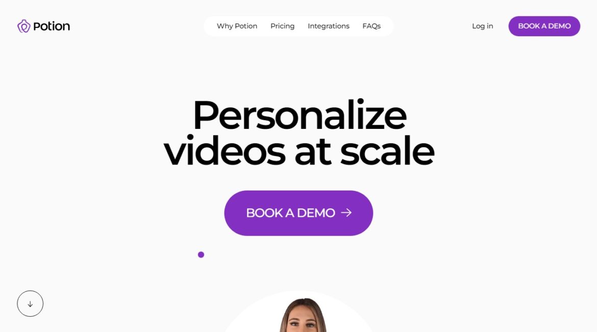
Potion offers modern and fun tools for making videos through their online storefront. It uses a lot of white space to direct readers’ focus toward highly visible call to actions (CTAs). It also utilizes a pastel color palette with bright tones to emphasize certain words, images, and videos.
Portion’s design uses parallax scrolling, GIFs, and animations throughout their website which gives the user a great experience. The whole experience on the site is engaging including the custom mouse pointer that follows your movements as you go through the website.
This website is a good ecommerce site example for its use of interactive elements on its user interface. It serves as a design example by incorporating features like layout, color palettes, and visual aesthetics to enhance user experience and product visibility.
2. Help Scout

Help Scout is one of the best tools I’ve used to manage my email list. They are constantly adding new features that make it easier to grow your audience. Their website has some great features that make it easy to navigate and get users to take action much quicker. For an ecommerce business, website design is crucial in enhancing the user experience, making sales, and retaining customers.
One such feature is a detailed mega menu with descriptions, hover effects over menu items to ensure the user understands they are clickable elements.
3. Bite Toothpaste Bits
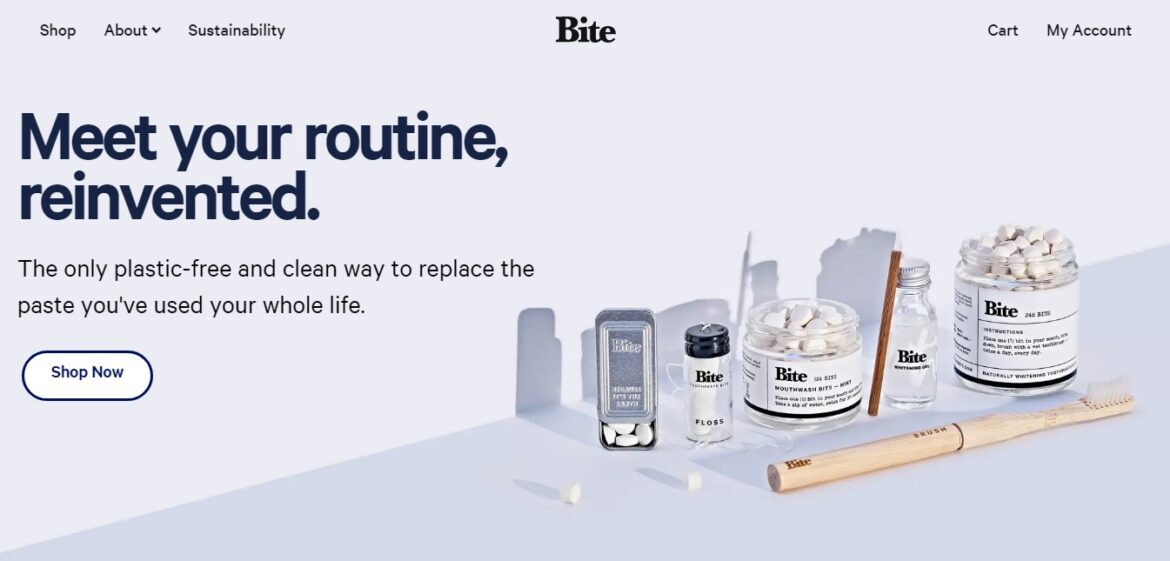
The Bite website uses animation to create an engaging experience for visitors. The ecommerce platform they use offers various tools for building online stores, emphasizing ease of use, customization options, robust security, and scalability. This is accomplished by creating a fun and memorable experience. The site is clean and simple, while still managing to convey a strong message.
And it does this without being too busy or overwhelming. There are no distractions. Instead, there is just one thing you want to do: buy their Heinen products. So, you simply follow the link to the checkout process.
4. Black Star Pastry
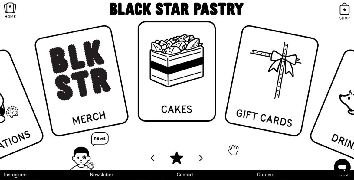
Black Star Pastry is an eCommerce site that sells pastry products including cakes, and drinks products online without having to build out their own storefront. Online stores on ecommerce platforms facilitate the creation and management of websites tailored for selling products. Instead, it offers a gamified experience where users earn points for every purchase they make. Users are rewarded with discounts, free shipping and exclusive deals.
The site features a split screen interface that allows users to browse through different product categories while still being able to see what items are available in each category. This way, they don’t have to scroll down to find something specific. They can simply pick up where they left off through the cart feature.
5. Nike
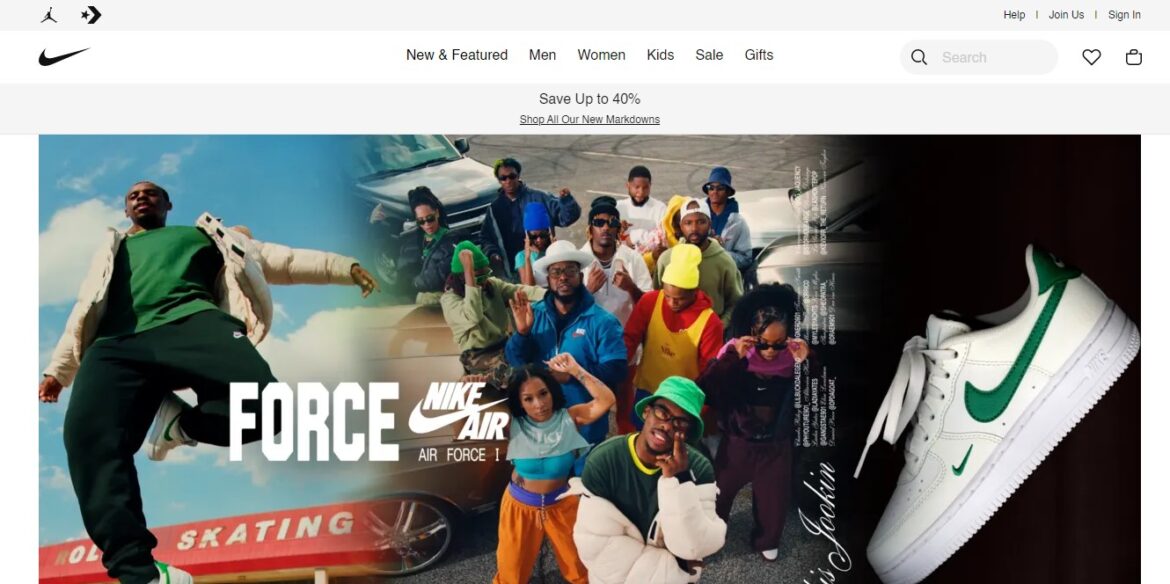
Nike is one of the biggest brands in the world, and it uses everything from social media to influencers to promote its products. Their ecommerce store is full of life, showcasing their products their users. They showcase people mainly in their youth to speak more to their target audience.
Nike uses clear and captivating imagery with no animations, more people to add some vibrancy to the website’s color. The ecommerce site’s clean design gives users access to the store products right on the homepage through various categories on shoes, clothing, bags and other accessories. They even offer membership for free which has some benefits. Nike is a prime example among ecommerce site examples that exemplify effective website design, with high-quality visuals, user engagement, and effective calls to action.
6. Frans Hals Museum
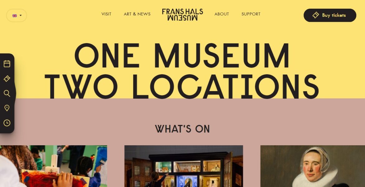
The Frans Hals Museum in Haarlem is one of the oldest museums in the Netherlands. Its collection includes paintings by Jan van Scorel, Maerten van Heemskerck, Hendrick Goltzius, Cornelis van Haarlem and more according to Wikipedia. Ecommerce website design examples showcase a variety of successful online store designs, highlighting specific features and elements that make them effective.
Its ecommerce design is different as what they are mainly selling is tickets to events held at the museum. When you enter the website you will see all the events laid out in a carousel on the homepage allowing to you purchase tickets by simply hovering over the event you want to attend and clicking on buy tickets.
7. The Scott Resort & Spa
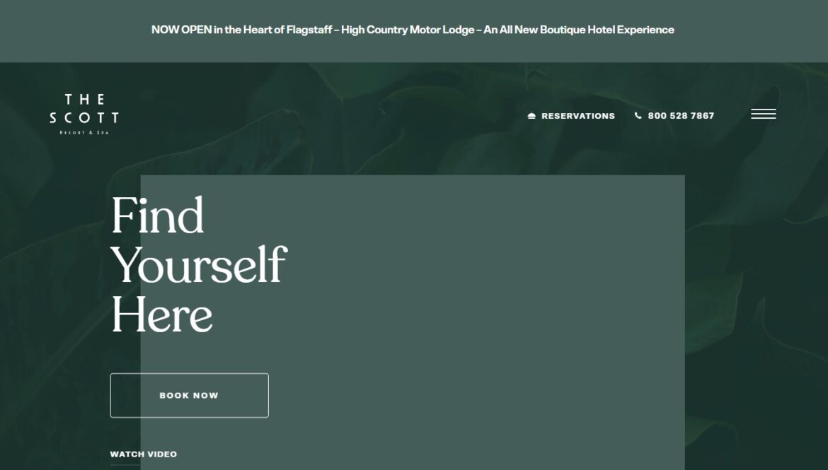
The Scott Resort & Spa is located in Scottsdale, Arizona. This luxury resort offers guests four distinct experiences including golfing, spa treatments, dining and events. The hotel features a state-of-the-art fitness center, indoor pool, hot tub, sauna and steam room.
Website users enjoy the ease of navigation, the animations as you move the site and the minimal menu design, and videos to give you apiece of experience. It serves as a great ecommerce website example, showcasing successful ecommerce sites across different industries with unique design elements and effective branding strategies.
8. Allbirds
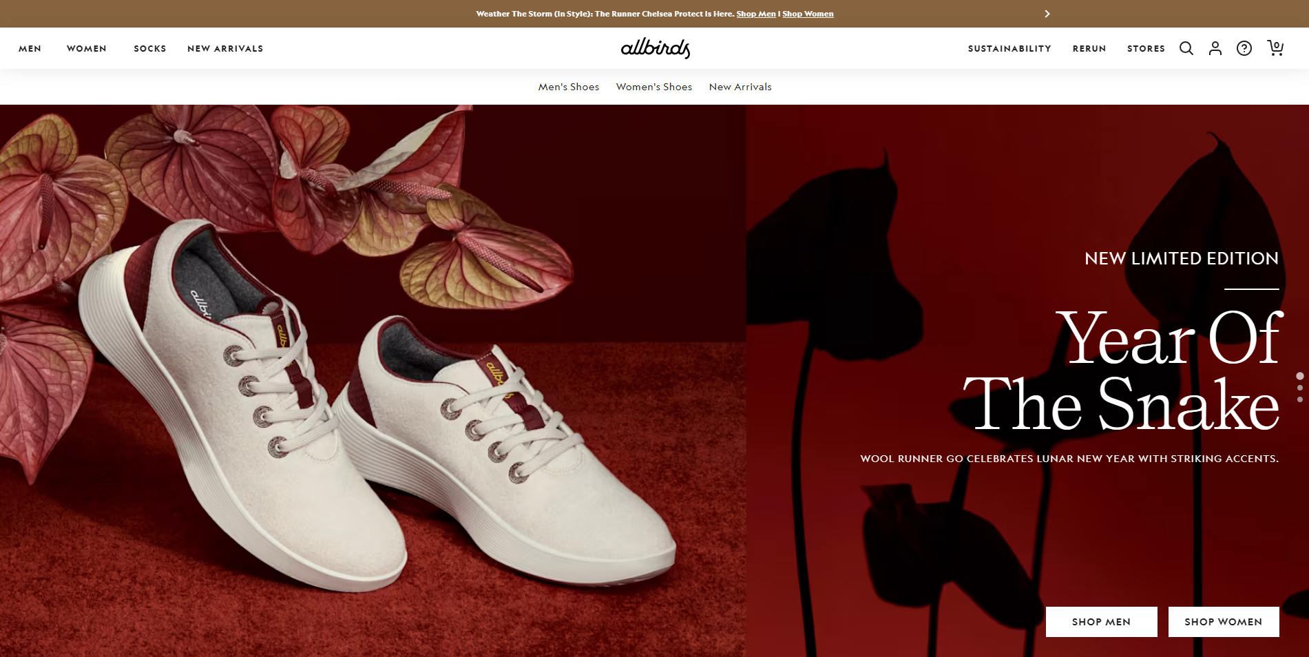
Allbirds is known for its sustainable and comfortable footwear. Their ecommerce website design emphasizes simplicity and eco-friendliness, using a clean layout and earthy color palette. The site features high-quality product images and detailed descriptions, making it easy for customers to find and purchase their ideal shoes. Allbirds also highlights their commitment to sustainability through engaging storytelling and interactive elements.
9. Welly
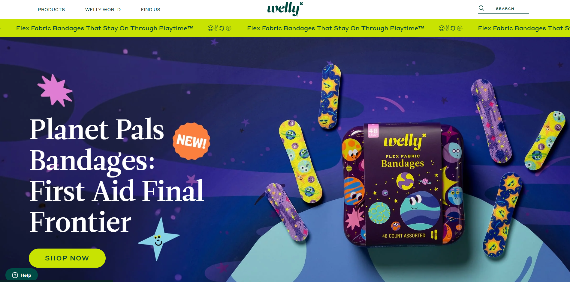
Welly offers a playful and colorful ecommerce site that sells first aid products. The website uses vibrant colors and fun illustrations to create a welcoming atmosphere. Interactive elements, such as hover effects, guide users through the site, while clear product categories and a user-friendly interface make it easy to shop online. Welly’s site effectively combines functionality with a distinctive brand personality.
10. Thesus
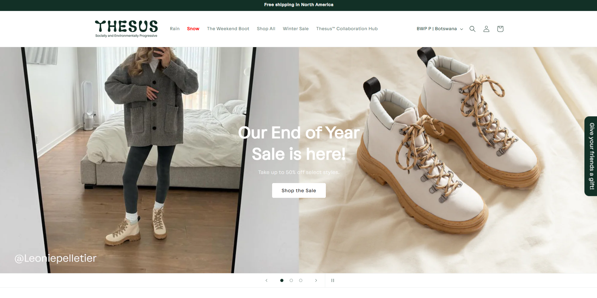
Thesus specializes in outdoor footwear, and their ecommerce platform reflects their adventurous spirit. The website’s design features stunning outdoor imagery and a cohesive color scheme that resonates with nature lovers. Thesus uses storytelling to convey their brand values and environmentally friendly practices, enhancing the overall shopping experience and connecting with their target audience.
11. Verve Coffee Roasters
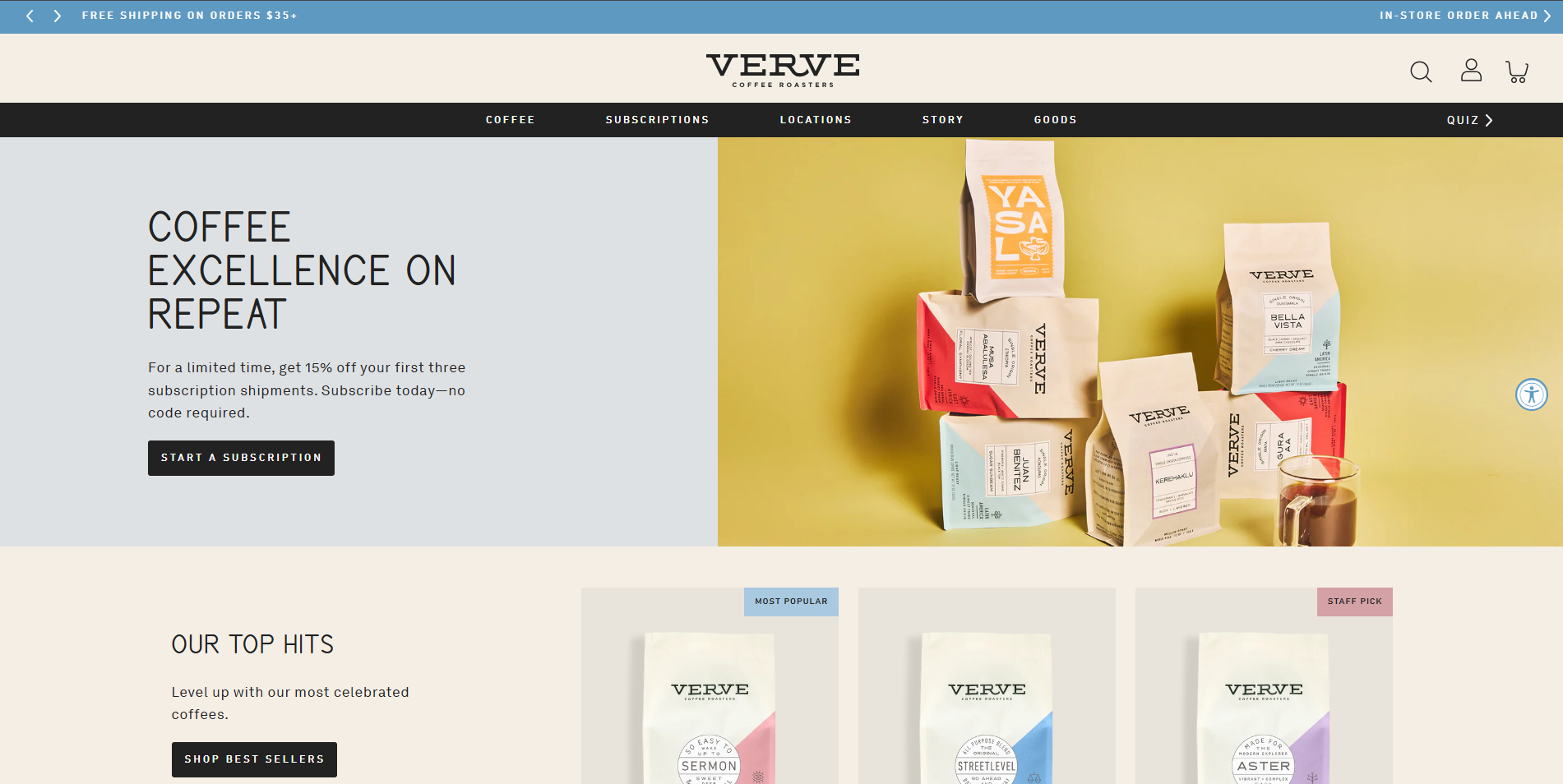
Verve Coffee Roasters offers an immersive online shopping experience for coffee enthusiasts. Their ecommerce site showcases beautiful photography and engaging content that highlights their passion for coffee. With an intuitive navigation system and detailed product pages, Verve makes it easy for customers to explore and purchase their favorite blends. The site also includes educational resources, enhancing the brand’s credibility and customer engagement.
12. Beardbrand
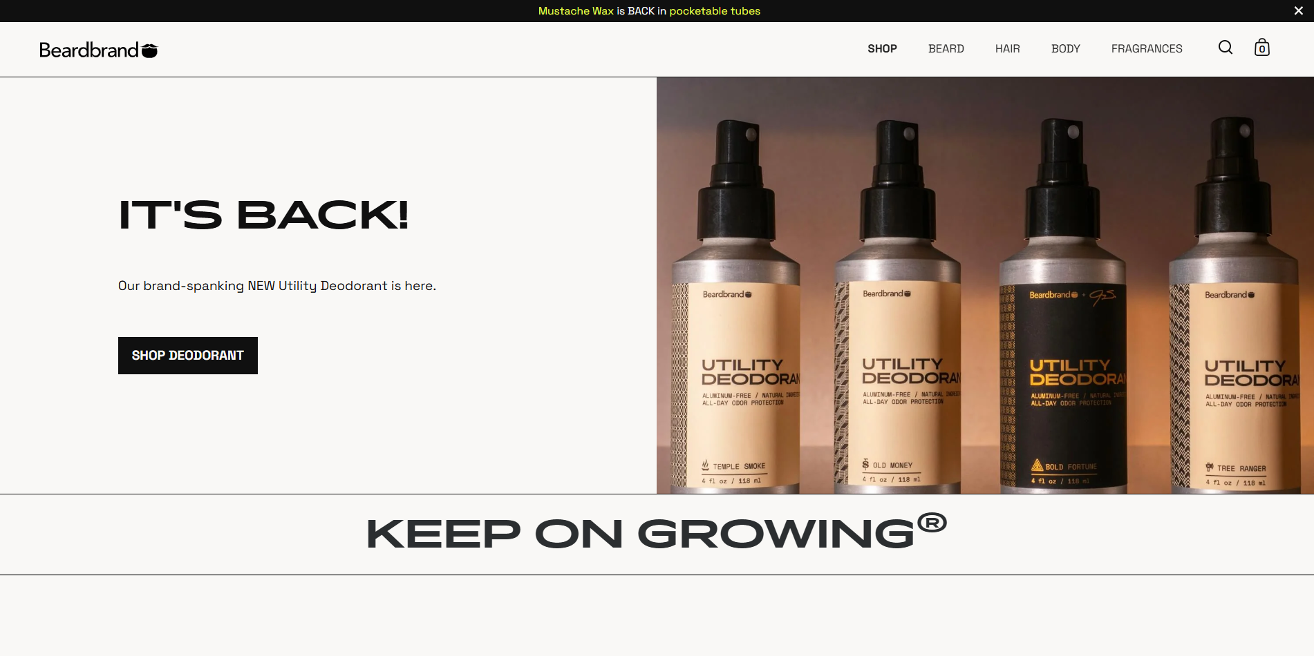
Beardbrand caters to grooming enthusiasts with a sleek and modern ecommerce website. The site features a minimalist design with high-quality product images and detailed descriptions. Beardbrand uses user-generated content, such as customer reviews and testimonials, to build trust and credibility. The website’s clean layout and easy navigation ensure a seamless shopping experience for customers.
13. Chubbies
Chubbies is known for its fun and vibrant approach to fashion. Their ecommerce site reflects this with bold colors, playful imagery, and engaging content. Chubbies uses humor and storytelling to connect with their audience, creating a memorable and enjoyable shopping experience. The website’s intuitive design and clear product categories make it easy for customers to find and purchase their favorite items.
14. MVMT
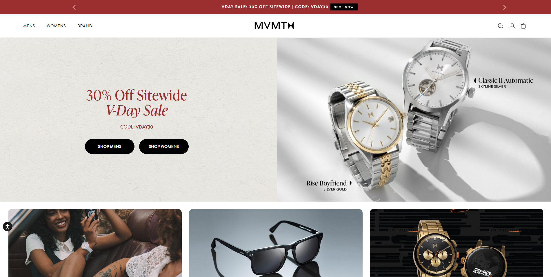
MVMT offers a sleek and stylish ecommerce website for their watches and accessories. The site features high-quality visuals and a modern design that aligns with their brand’s minimalist aesthetic. MVMT uses a clean layout and intuitive navigation to enhance user experience, while detailed product pages provide all the necessary information for customers to make informed purchasing decisions.
15. Tessemae’s
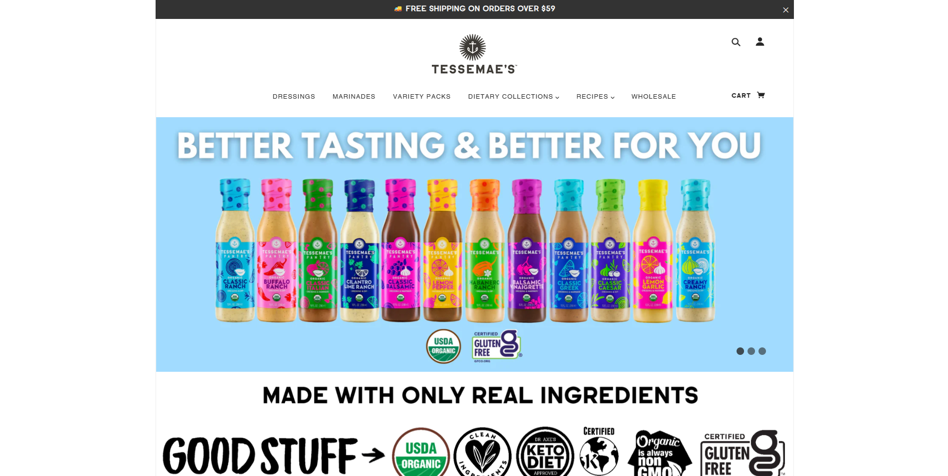
Tessemae’s brings healthy eating to the forefront with their visually appealing ecommerce site. The website features vibrant imagery and a clean design that reflects their commitment to natural ingredients. Tessemae’s uses storytelling and engaging content to communicate their brand values, while easy navigation and clear product categories make it simple for customers to explore and purchase their products.
16. Bliss
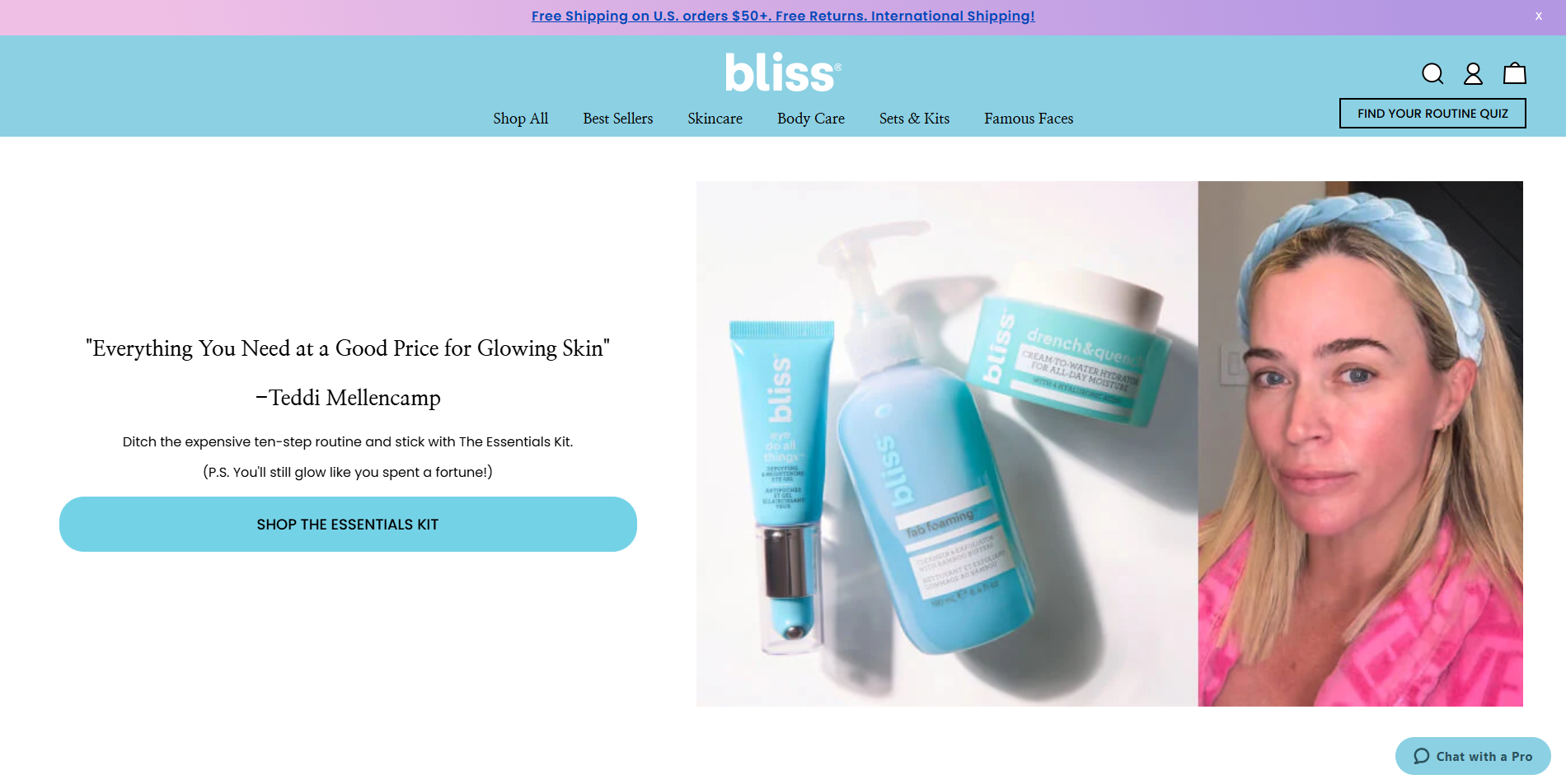
Bliss is a skincare brand that offers a bright and cheerful ecommerce website. The site uses a playful color palette and engaging visuals to create a welcoming atmosphere. Bliss features detailed product descriptions and customer reviews to build trust and credibility. The website’s user-friendly design and intuitive navigation make it easy for customers to find and purchase their favorite skincare products.
17. Ocelot Chocolate
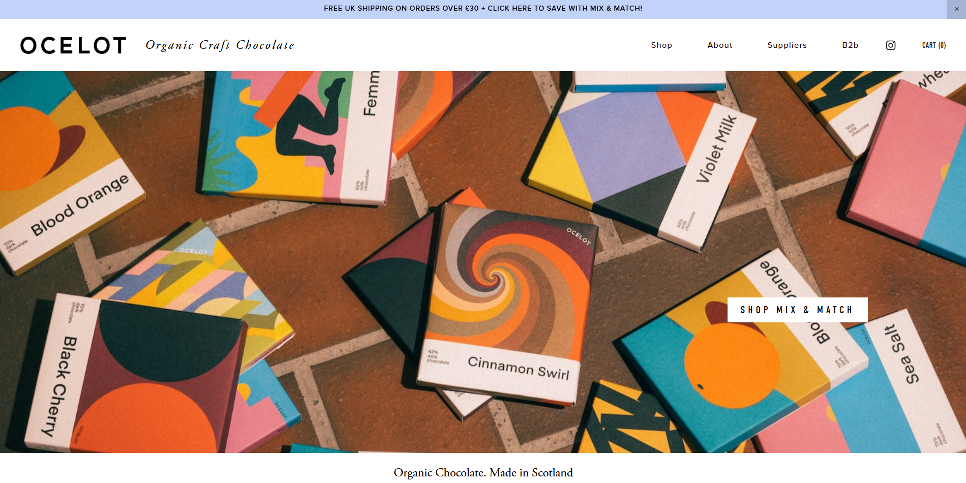
Ocelot Chocolate is a boutique chocolate brand with a beautifully designed ecommerce site. The website features stunning visuals and a minimalist layout that highlights their artisanal products. Ocelot Chocolate uses storytelling to convey their brand’s unique value proposition, while clear product categories and easy navigation enhance the overall shopping experience.
18. Amazon
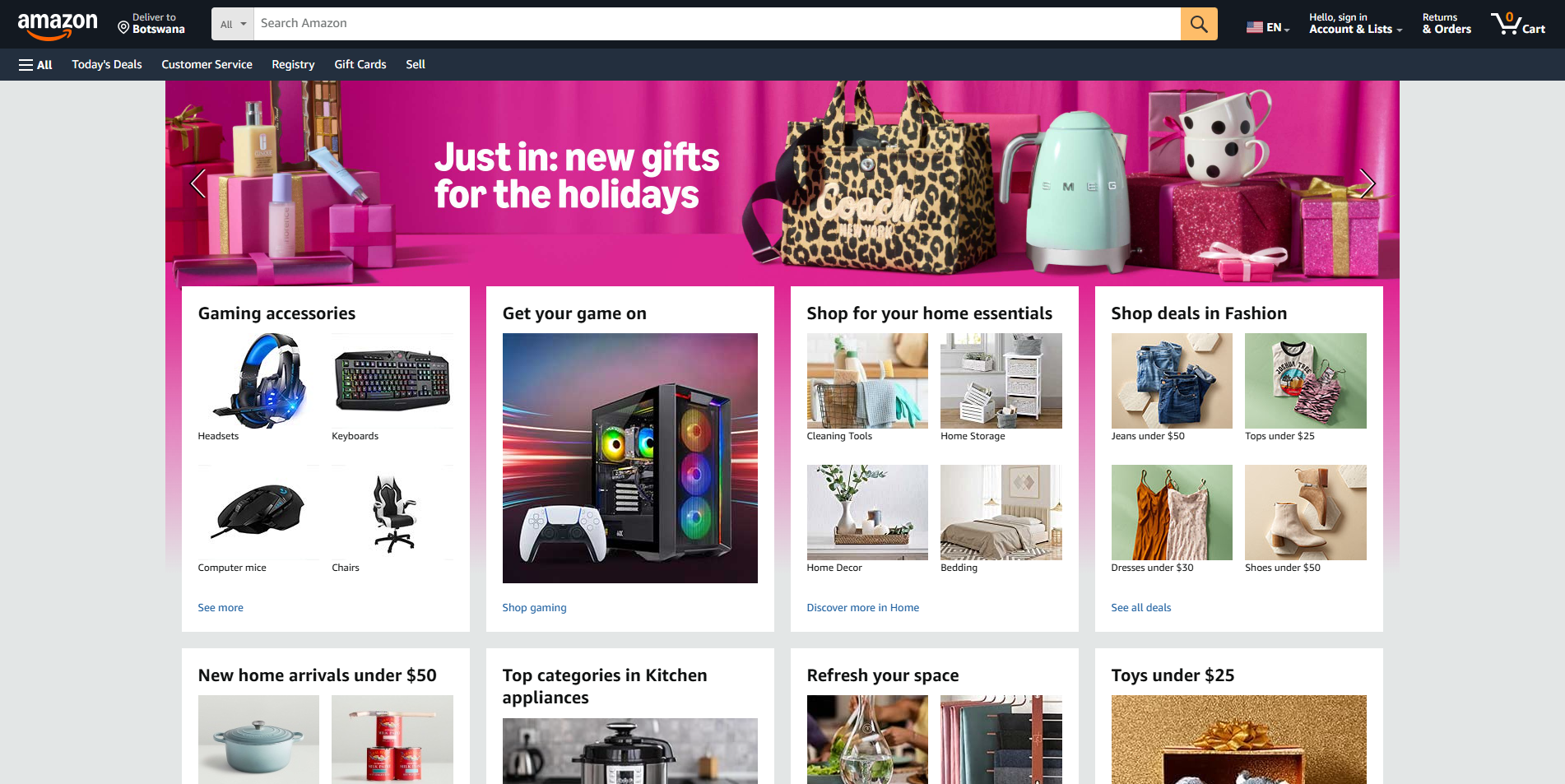
Amazon is a giant in the ecommerce industry, known for its extensive product range and user-friendly website. The site features a straightforward design with powerful search and filtering options, making it easy for customers to find and purchase products. Amazon’s use of customer reviews and ratings provides valuable social proof, building trust and credibility with potential buyers.
19. Apple
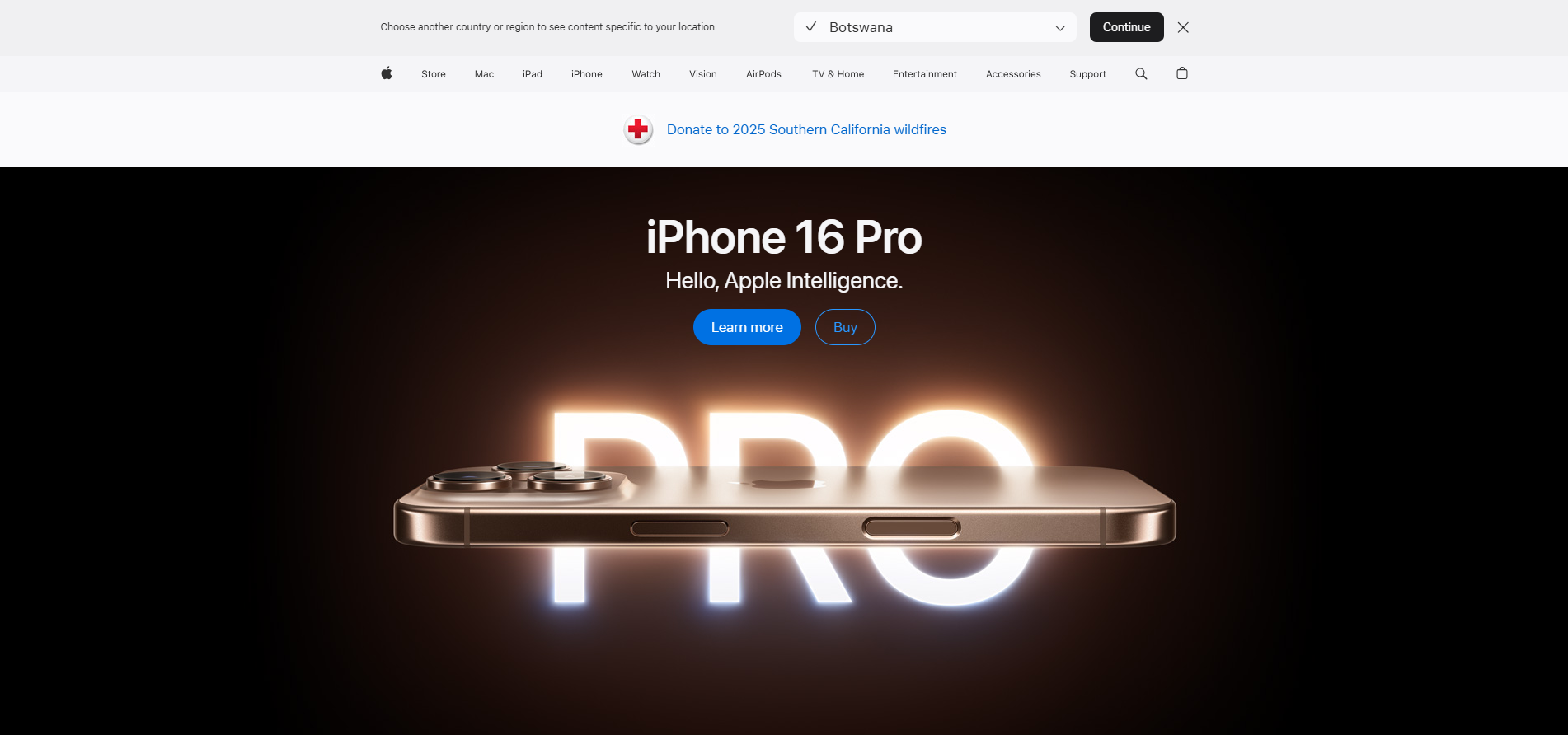
Apple offers a sleek and modern ecommerce website that aligns with their brand’s minimalist aesthetic. The site features high-quality visuals and detailed product pages that showcase their innovative technology. Apple’s intuitive navigation and engaging content create a seamless shopping experience, while their emphasis on design and functionality sets them apart as a leader in ecommerce.
20. Grovemade
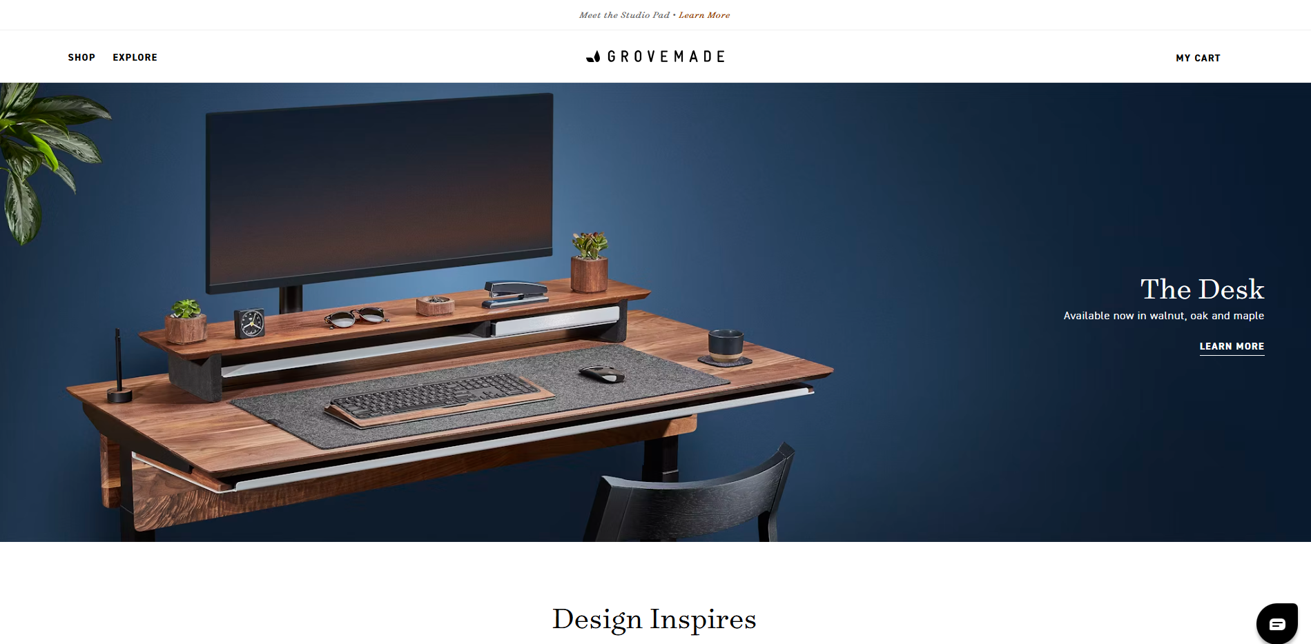
Grovemade specializes in handcrafted accessories, and their ecommerce site reflects their commitment to quality and craftsmanship. The website features beautiful photography and a clean design that highlights their products. Grovemade uses storytelling and engaging content to convey their brand values, while easy navigation and clear product categories enhance the overall shopping experience.
21. LARQ
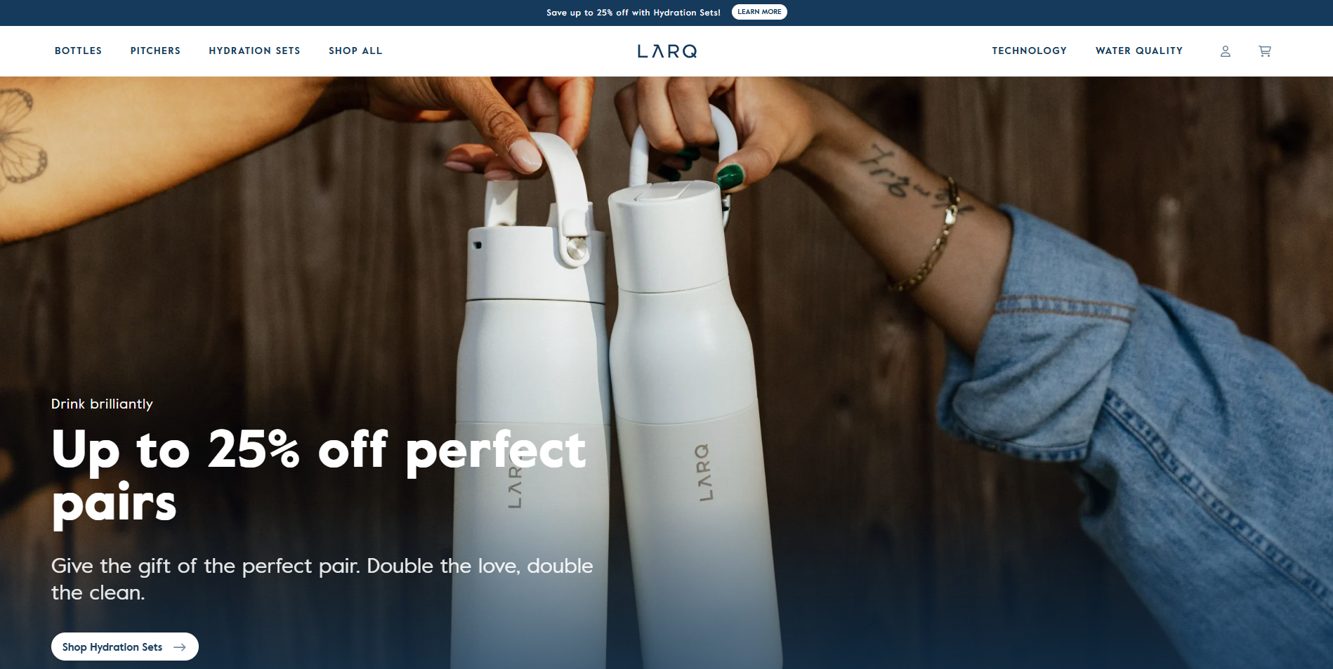
LARQ offers a modern and visually appealing ecommerce website for their innovative water bottles. The site features high-quality visuals and engaging content that highlights their unique value proposition. LARQ uses a clean layout and intuitive navigation to enhance user experience, while detailed product pages provide all the necessary information for customers to make informed purchasing decisions.
22. Crate and Barrel
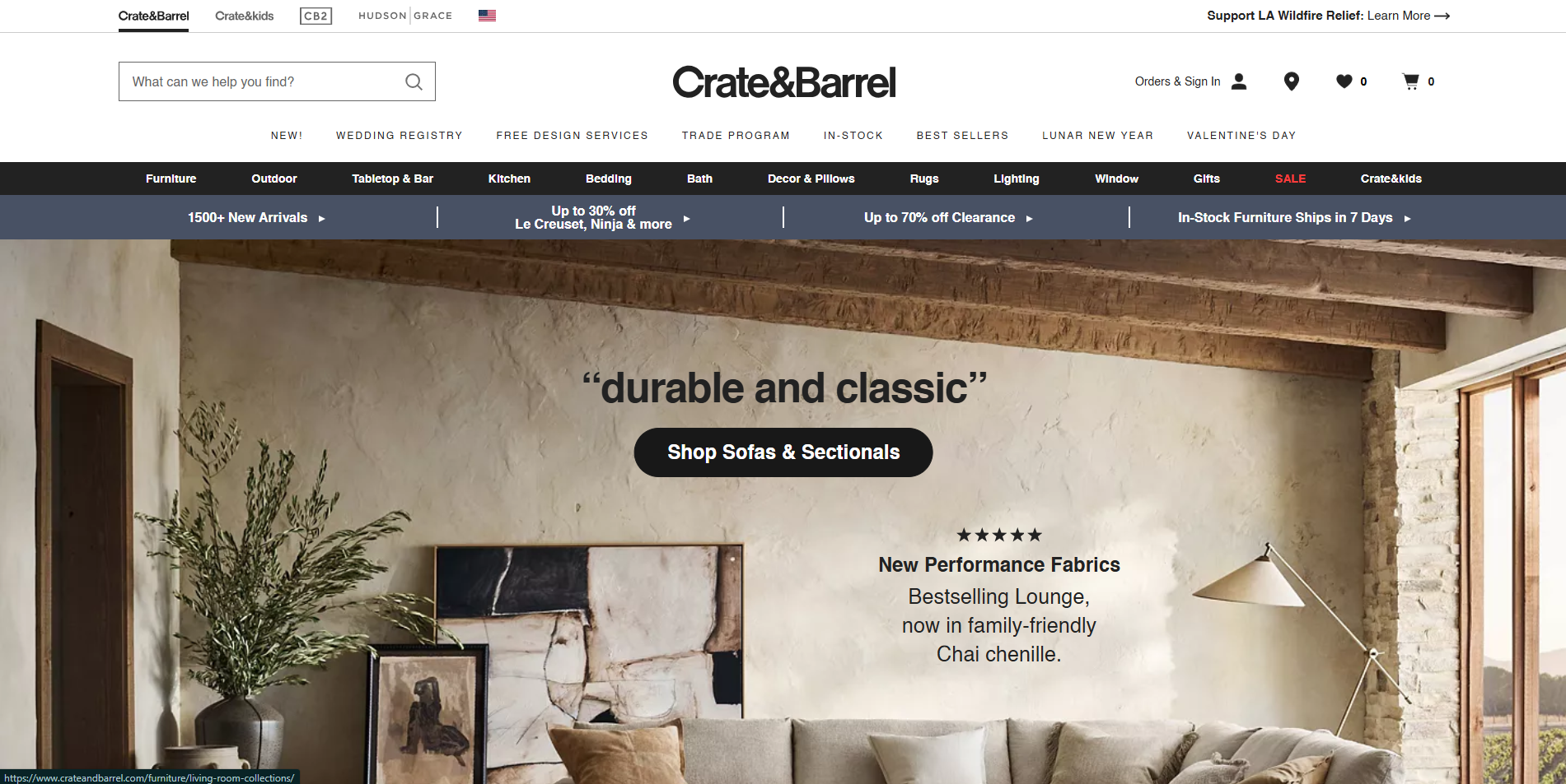
Crate and Barrel is a home furnishings brand with a sophisticated ecommerce site. The website features beautiful imagery and a clean design that showcases their products. Crate and Barrel use storytelling and engaging content to convey their brand values, while easy navigation and clear product categories make it simple for customers to explore and purchase their favorite items.
23. Solo Stove
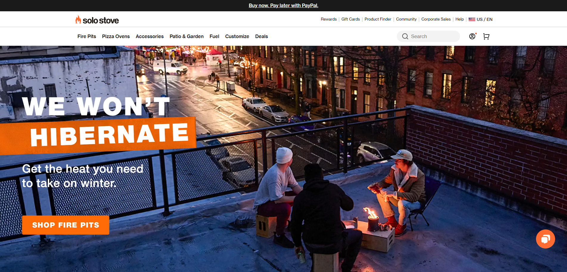
Solo Stove offers a sleek and modern ecommerce website for their outdoor cooking products. The site features high-quality visuals and engaging content that highlights their innovative designs. Solo Stove uses a clean layout and intuitive navigation to enhance user experience, while detailed product pages provide all the necessary information for customers to make informed purchasing decisions.
24. Spotify
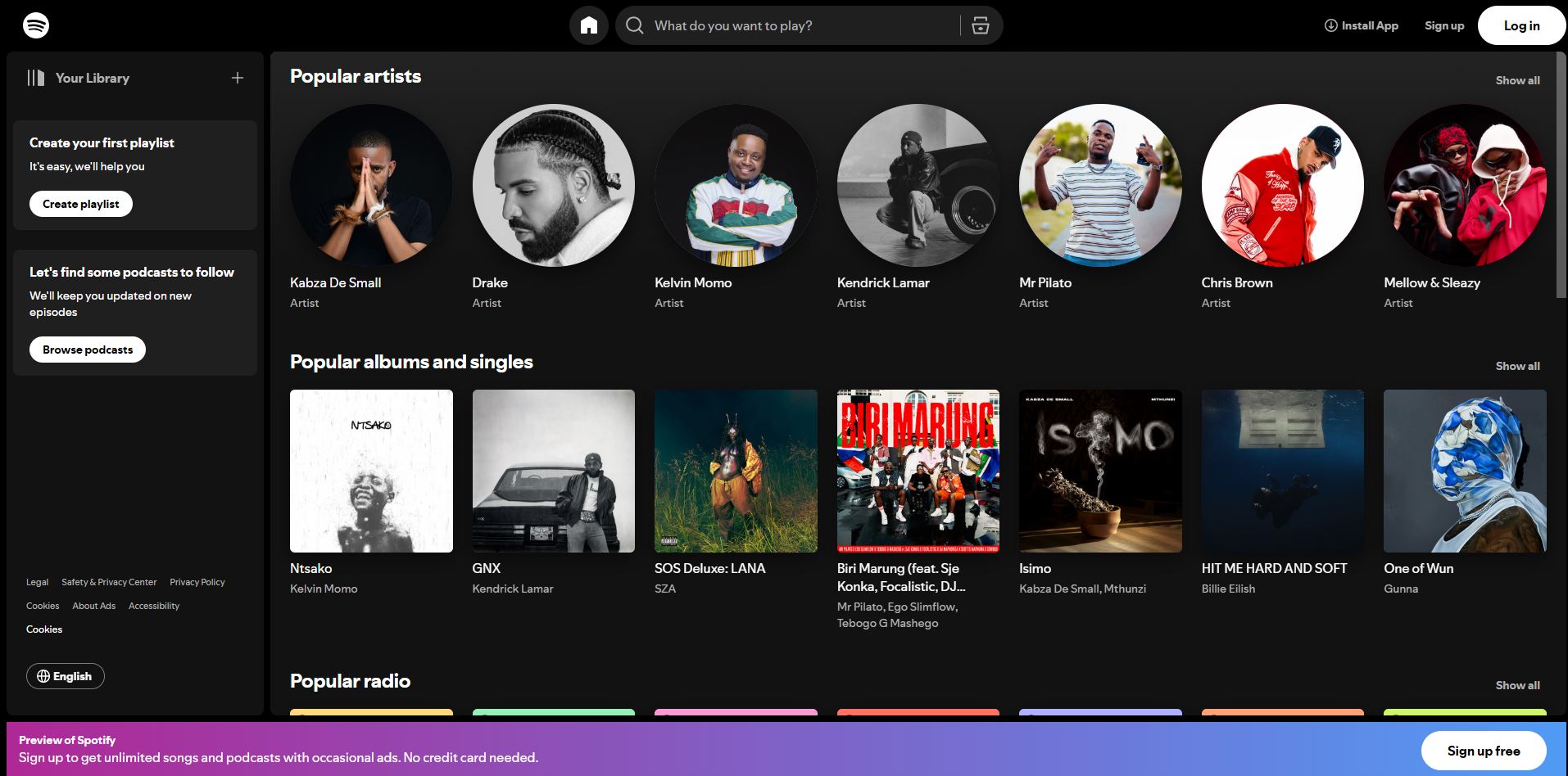
Spotify is a leading music streaming service with a user-friendly ecommerce site. The website features a clean design and intuitive navigation, making it easy for users to explore and purchase premium subscriptions. Spotify uses engaging content and interactive elements to enhance user experience, while their emphasis on design and functionality sets them apart as a leader in the industry.
25. The Mountain
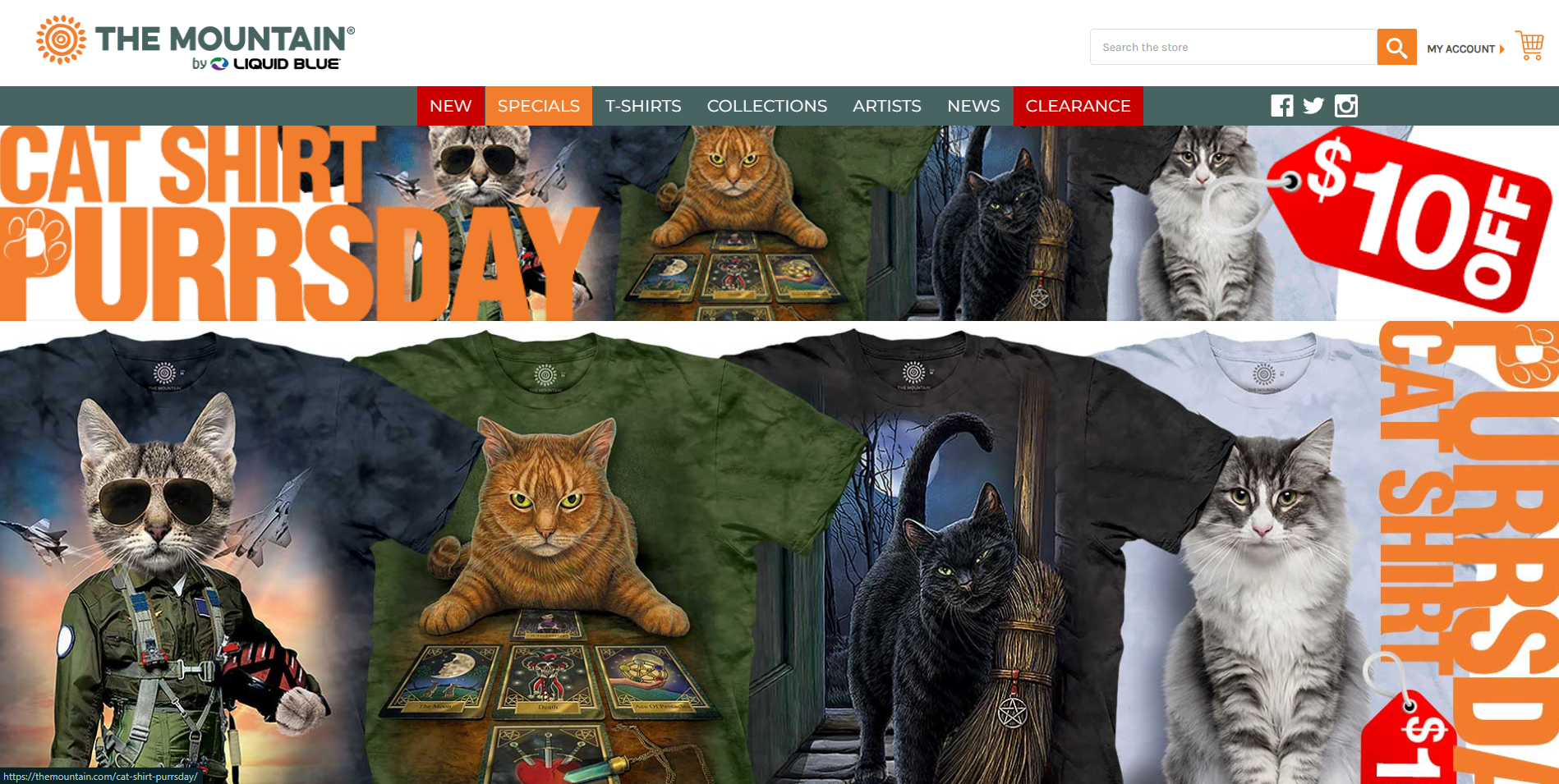
The Mountain is known for their unique and artistic apparel, and their ecommerce site reflects this with bold visuals and engaging content. The website features a clean design and easy navigation, making it simple for customers to explore and purchase their favorite items. The Mountain uses storytelling and user-generated content to build trust and credibility with potential buyers.
26. Aesop
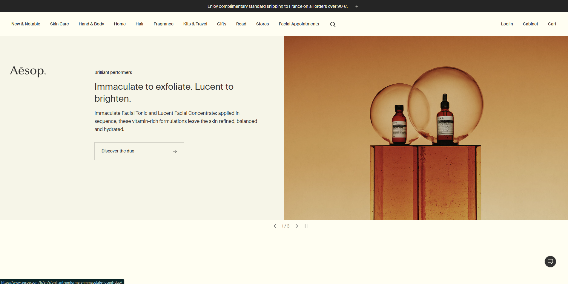
Aesop offers a sophisticated ecommerce website for their luxury skincare products. The site features high-quality visuals and engaging content that highlights their unique formulations. Aesop uses a clean layout and intuitive navigation to enhance user experience, while detailed product pages provide all the necessary information for customers to make informed purchasing decisions.
27. Burrow
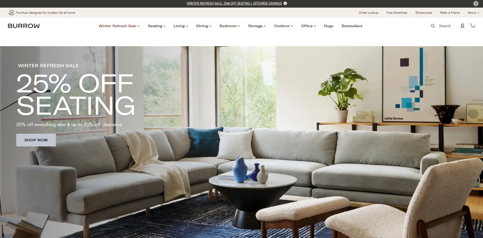
Burrow specializes in modular furniture, and their ecommerce site reflects their commitment to quality and innovation. The website features beautiful photography and a clean design that highlights their products. Burrow uses storytelling and engaging content to convey their brand values, while easy navigation and clear product categories enhance the overall shopping experience.
28. Warby Parker
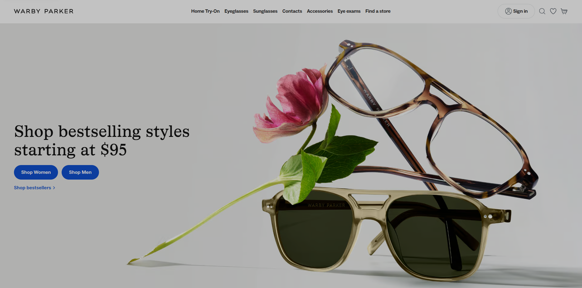
Warby Parker is an innovative eyewear brand known for its stylish and affordable glasses. Their ecommerce website design is clean and user-friendly, featuring high-quality product images and virtual try-on options that enhance the shopping experience. Warby Parker uses storytelling to convey their brand values and commitment to social responsibility, while detailed product pages provide all the necessary information for customers to make informed purchasing decisions.
29. Glossier
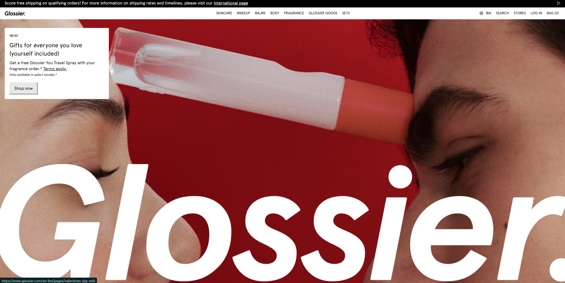
Glossier is a beauty brand that has gained a cult following for its minimalist and user-friendly ecommerce website. The site features a clean design with a focus on high-quality product images and engaging content. Glossier uses storytelling and user-generated content to connect with their audience, building trust and credibility. The website’s intuitive navigation and seamless shopping experience make it easy for customers to explore and purchase their favorite beauty products.
30. Casper
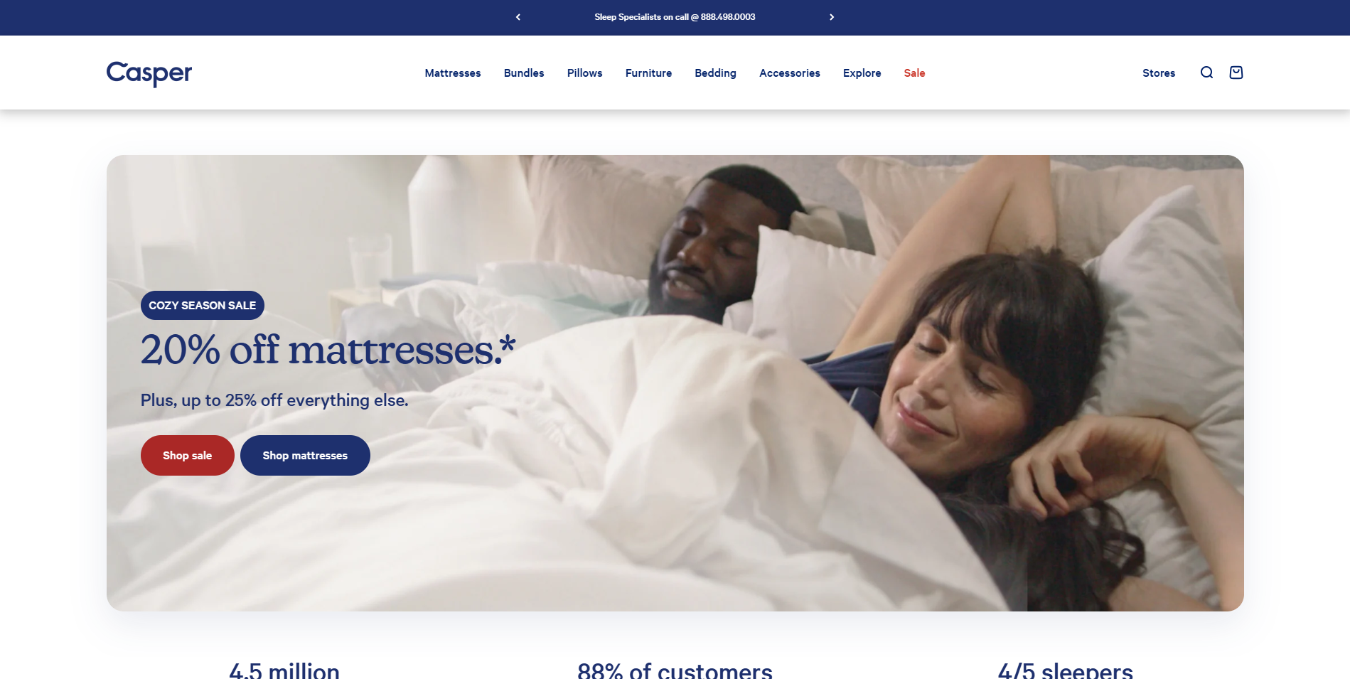
Casper is a popular mattress brand known for its innovative ecommerce site. The website features a clean design with high-quality visuals and engaging content that highlights their unique value proposition. Casper uses storytelling and interactive elements to enhance user experience, while detailed product pages provide all the necessary information for customers to make informed purchasing decisions.
31. Everlane
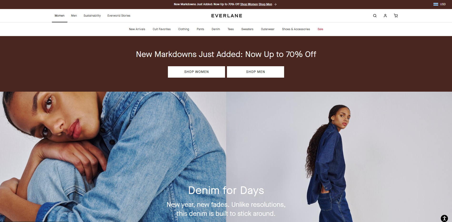
Everlane is a fashion brand that emphasizes transparency and ethical production practices. Their ecommerce website design is clean and minimalist, featuring high-quality product images and detailed descriptions. Everlane uses storytelling to convey their brand values and commitment to sustainability, enhancing the overall shopping experience and connecting with their target audience.
32. Bonobos
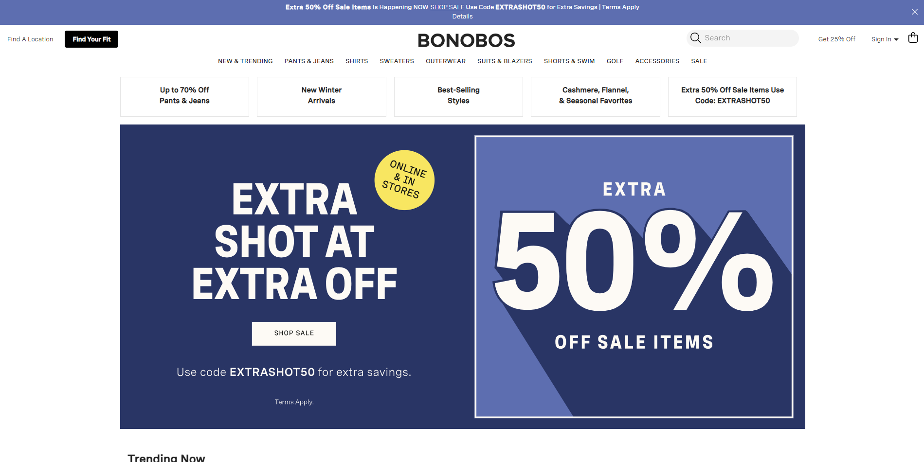
Bonobos is a menswear brand known for its modern and stylish ecommerce site. The website features a clean design with high-quality visuals and intuitive navigation, making it easy for customers to explore and purchase their favorite items. Bonobos uses storytelling and user-generated content to build trust and credibility, while detailed product pages provide all the necessary information for customers to make informed purchasing decisions.
33. Outdoor Voices
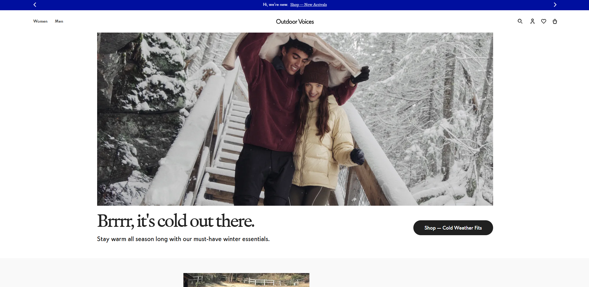
Outdoor Voices is an activewear brand that promotes an active lifestyle through its visually appealing ecommerce website. The site features a clean design with high-quality product images and engaging content that highlights their commitment to sustainability and community. Outdoor Voices uses storytelling and interactive elements to enhance user experience, while detailed product pages provide all the necessary information for customers to make informed purchasing decisions.
What Makes a Great eCommerce Website
A great eCommerce website is one that effectively balances form and function to provide a seamless user experience, build trust with customers, and ultimately drive sales. Several key elements contribute to making an eCommerce website great.
Building Trust with Customers
Building trust with customers is crucial for the success of an eCommerce website. This can be achieved by:
Displaying Clear Contact Information: Make it easy for customers to reach you by providing a physical address, phone number, and email address. This transparency reassures customers that they are dealing with a legitimate business.
Comprehensive Return and Refund Policy: Clearly outline your return and refund policies. This not only builds trust but also reduces potential friction during the purchasing process.
Showcasing Customer Reviews and Ratings: User-generated content, such as reviews and ratings, can significantly influence purchasing decisions. Displaying these on your product pages can build credibility and trust.
Secure Payment Options and Trust Badges: Offer multiple secure payment options and display trust badges from recognized security providers. This reassures customers that their payment information is safe.
Consistent Brand Image: Ensure that your brand values are consistently reflected throughout your website. A professional and cohesive design helps build a strong brand identity and trust.
By implementing these trust-building elements, eCommerce websites can establish credibility and confidence with their customers, leading to increased conversions and loyalty.
Creating a Visually Compelling Experience
A visually compelling experience is essential for capturing the attention of potential customers and keeping them engaged with the website. This can be achieved by:
High-Quality Product Images and Videos: Use high-resolution images and videos to showcase your products from multiple angles. This helps customers make informed purchasing decisions.
Responsive Design: Ensure your eCommerce website design is responsive, adapting seamlessly to different devices and screen sizes. This is crucial as more users shop on mobile devices.
Clear and Consistent Typography and Color Scheme: Use a consistent typography and color scheme that aligns with your brand values. This creates a cohesive and professional look.
Interactive Elements: Incorporate interactive elements such as animations, hover effects, and parallax scrolling to enhance user engagement and make the browsing experience more enjoyable.
Fast Loading Speed: Optimize your website for fast loading times. A slow website can frustrate users and lead to higher bounce rates.
By creating a visually compelling experience, eCommerce websites can effectively showcase their products, communicate their brand values, and provide an enjoyable user experience.
Characteristics of a Successful eCommerce Site
A successful eCommerce site possesses several key characteristics that contribute to its success. Some of these characteristics include:
Easy Navigation
Easy navigation is essential for a successful eCommerce site. This can be achieved by:
Clear and Concise Menu Structure: Organize your menu in a logical and straightforward manner. Use categories and subcategories to help users find what they are looking for quickly.
Intuitive and Descriptive Navigation Labels: Use clear and descriptive labels for your navigation links. Avoid jargon and use terms that your customers are familiar with.
Prominent Search Bar and Filtering Options: Provide a prominent search bar and advanced filtering options to help users narrow down their search results. This is especially important for eCommerce sites with a large inventory.
Responsive Design: Ensure your navigation is responsive and works well on all devices, including mobile devices. This enhances the user experience and makes it easier for customers to browse your site on the go.
Minimizing Clicks to Product Pages: Reduce the number of clicks required to reach a product page. The fewer steps a customer has to take, the more likely they are to complete a purchase.
By providing easy navigation, eCommerce sites can reduce bounce rates, increase conversions, and improve the overall user experience.
What are eCommerce Website Design Best Practices?
There are many different ways to build an effective ecommerce website. Web design is a crucial element for engaging users and enhancing brand identity. You don’t necessarily have to use every single one of those options. However, there are some best practices and examples that you can follow to make sure your site looks professional and modern.
The most important thing about creating a good ecommerce website design is making it look like something that belongs on the web. A lot of people think that just because it’s online, it doesn’t matter how it looks. This couldn’t be further from the truth. If you want to attract visitors and keep them engaged, you’ll need to make your ecommerce website design stand out.
Your customers will appreciate your efforts once you do. They’re looking for a seamless shopping experience, and if yours isn’t up to par, they won’t stick around long enough to find what they came to buy.
Create a Modern eCommerce Theme/ Design with ecommerce website design examples
When building an ecommerce website, creating a modern and visually appealing theme is essential. A well-chosen theme not only sets the tone for your entire website but also enhances user experience and brand identity. It serves as the foundation upon which you can build a successful ecommerce business. With numerous ecommerce website design examples available, you can draw inspiration to create a theme that resonates with your target audience.
Start by considering your brand’s unique value proposition and audience preferences. A theme should reflect your brand’s personality while being user-friendly and visually appealing. If you’re working on a new project, begin with a blank canvas, but avoid straying too far from your brand’s core values. Instead, select a theme that aligns with your products and brand message.
For instance, if you sell jewelry, opt for a simple and elegant design that highlights the beauty and craftsmanship of your pieces. On the other hand, if you sell clothing, consider a trendy and colorful theme that reflects the latest fashion trends. Incorporate interactive elements, such as animations and parallax scrolling, to engage users and create a memorable shopping experience.
Ensure that your theme is responsive and mobile-friendly. With an increasing number of users shopping on mobile devices, optimizing your site for different screen sizes is crucial. A mobile-optimized theme not only enhances user experience but also improves your site’s search engine optimization, making it easier for potential customers to find your online store.
Incorporate trust-building elements, such as customer reviews, secure payment options, and clear contact information, to reassure customers and build credibility. By emphasizing user experience, mobile optimization, and trust-building elements in your ecommerce website design, you can create a successful online store that stands out in a competitive market.
